
The hidden power of typography in brand recognition
Type does more than say words — it shapes how your brand feels.
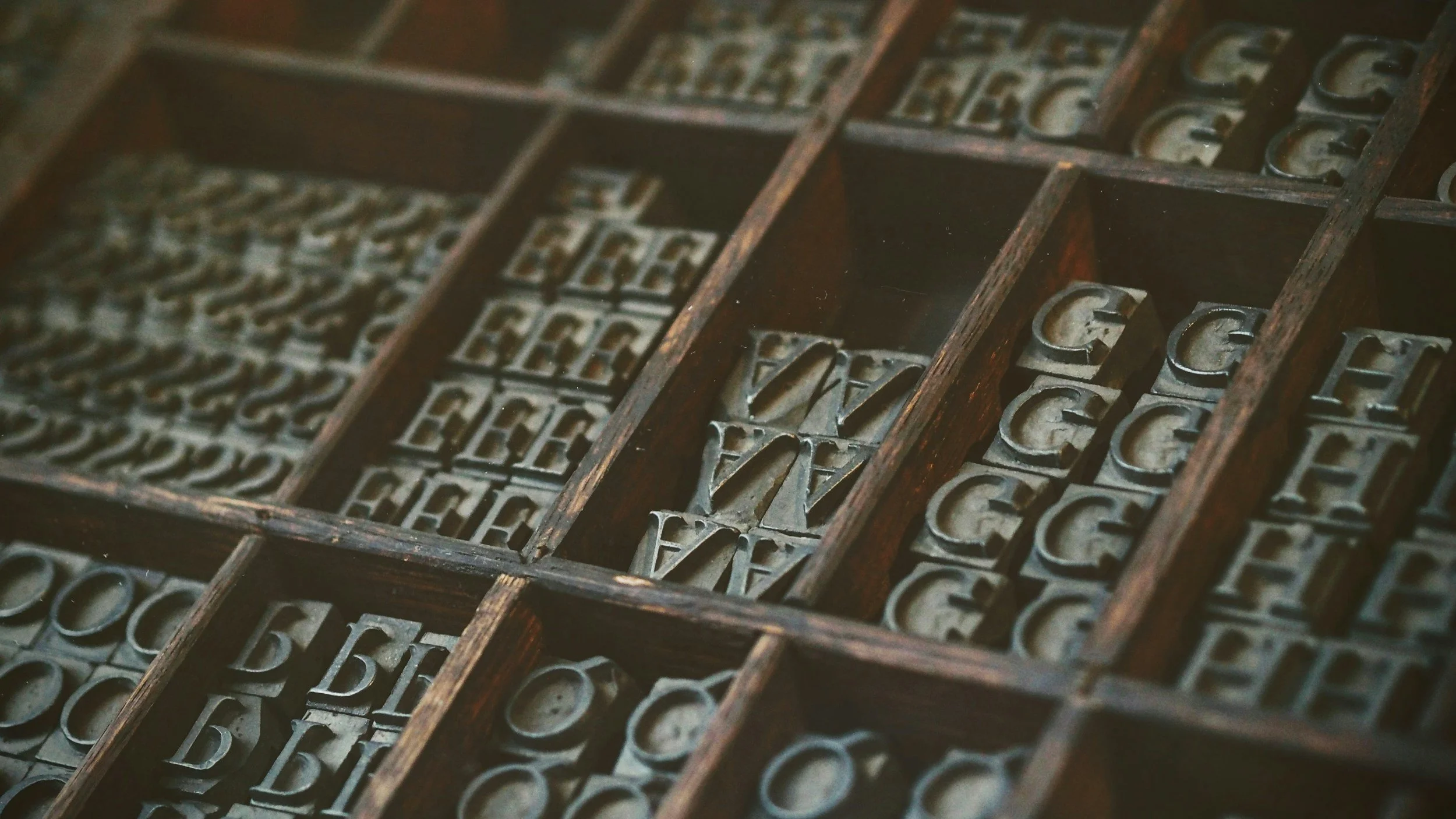
Typography is one of the most underestimated tools in brand design. Most people don’t consciously notice it, but they feel it. The way your letters are formed, spaced, and styled communicates as much about your brand as your logo or colour palette.
At Keel Studio, we see typography as the tone of voice of visual identity - subtle, consistent, and powerful when used with intent.
The science behind type and memory
Typography isn’t just about aesthetics; it’s about cognition and emotion. Studies show that distinctive letterforms improve brand recall, our brains connect shapes and spacing with familiarity, even before we consciously register the words.
That’s why Coca-Cola, The New York Times, and NASA all have instantly recognisable typography, it’s not the logo that makes them memorable, it’s the consistency of form.
A strong typographic system doesn’t just tell your story, it makes people remember it.
Type as personality
Typography carries personality in every curve, edge, and contrast. Sans-serifs often feel modern and minimal; serifs convey trust and heritage. Script fonts can feel human or expressive; monospaced fonts can suggest technical precision.
But it’s not about picking one style, it’s about finding the voice that matches your brand’s truth.
When we work with clients, we often start by asking:
How should your brand sound if it could speak?
Is it confident or understated? Playful or refined?
Should it blend in, or stand apart?
Those answers guide every typographic decision that follows.
The role of typography in visual systems
Great typography builds structure and rhythm. It defines hierarchy, creates pace, and leads the viewer through a brand experience seamlessly, from website to packaging to presentation decks.
At Keel Studio, we treat type as the connective tissue that holds the visual system together. We design custom typographic scales, line spacing, and weights to create consistency and flow across all brand touchpoints.
Because when typography is thoughtful, users don’t have to think, they just understand.
How Keel Studio approaches type
Our approach to typography is grounded in three principles:
Clarity: The best typography supports content, never competes with it.
Character: Every type choice should reinforce a brand’s essence.
Continuity: Good typography scales effortlessly, from digital screens to print, from a tagline to a billboard.
It’s this balance of precision and personality that allows brands to feel cohesive and credible everywhere they show up.
A quiet form of distinction
Some of the most iconic brands don’t rely on flashy logos at all, their typography does the heavy lifting. Think Apple, Google, or The Guardian. Their type choices are so consistent that the words alone feel branded.
That’s the power of getting typography right: it makes your brand identifiable even when the logo isn’t visible. Good typography whispers. Great typography resonates.
Want to give your brand a voice that’s instantly recognisable?
Typography isn’t decoration - it’s strategy. If your brand feels inconsistent, outdated, or forgettable, we can help you rediscover your visual voice through type, tone, and design precision.