
Health Policy Explained
Services
Brand Identity
Logo design
Industry
Healthcare
Year
2023
Overview
Health Policy Explained is a specialist consultancy working at the intersection of healthcare and policy. Their mission is to decode complex healthcare policy frameworks in the UK and communicate them clearly to clients, ranging from NHS trusts to global pharmaceutical companies.
When they approached us, they were at the very start of their journey. They needed a brand that communicated authority and professionalism, but also a human touch. The challenge was to strike a delicate balance: feeling credible enough for major health bodies, while remaining approachable and collaborative.
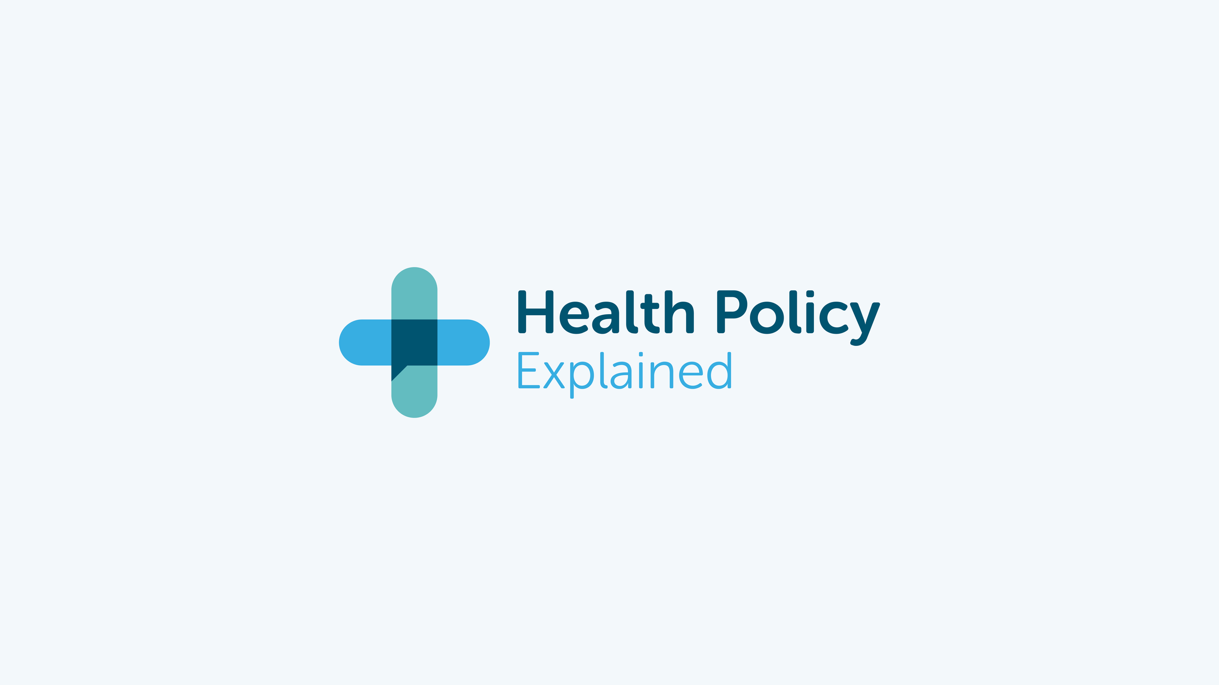
At the heart of the visual identity is a custom logo mark that brings together two core ideas: the universally recognised healthcare cross and a speech bubble, integrated through overlapping shapes and negative space.
This smart visual metaphor communicates exactly what the brand does: interprets health policy and makes it understandable. The result is a symbol that feels modern, meaningful and distinct in a space that can often be overly clinical or corporate.


Modern, professional and quietly confident.
The wider identity system leans into a palette of fresh, clinical blues that feel trustworthy without being cold. Rounded, modern typography supports clarity and accessibility, reinforcing the brand's promise to remove jargon and deliver insight.
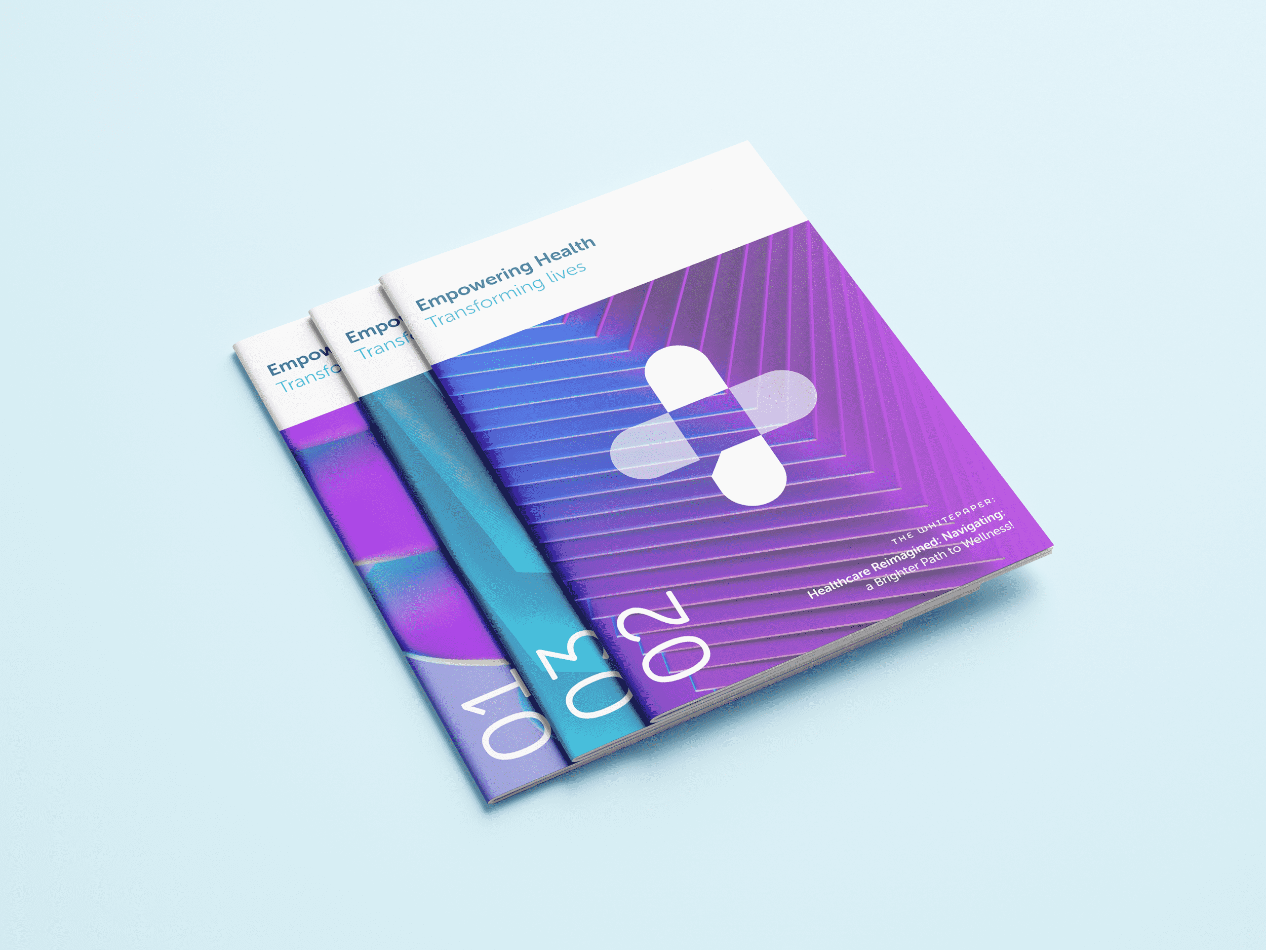
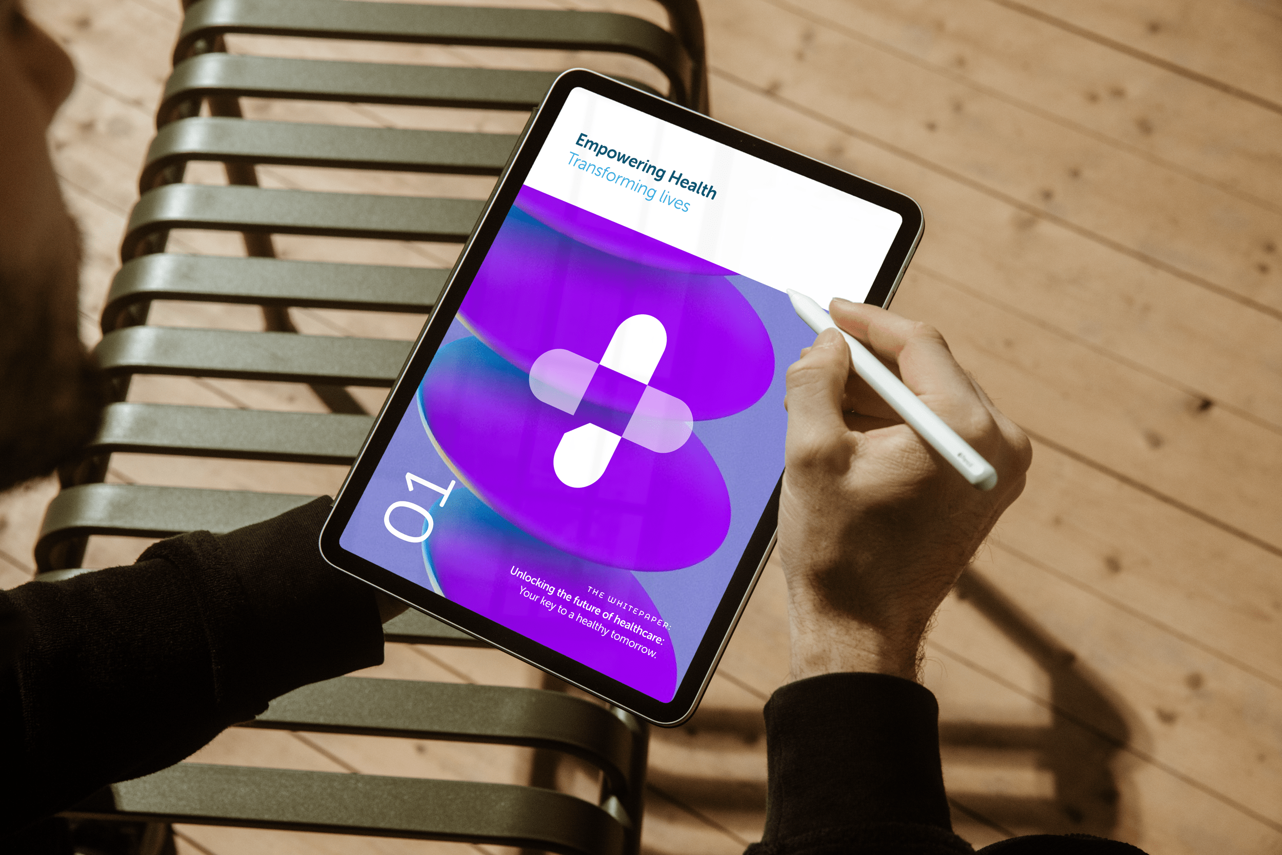
The visual language is designed to scale, from detailed strategy documents to front-line digital campaigns, and remains consistent across all touchpoints.
Deliverables included:
Logo and brand identity system
Brand guidelines
Business cards, brochures, and flyers
Digital advertising assets

The Outcome
Expert, but approachable.
With its clear, professional tone and a logo that cleverly encapsulates the brand’s mission, Health Policy Explained now stands as a confident and credible voice in healthcare consultancy.
The new identity enables them to connect effectively with both national institutions and local teams, supporting collaboration at every level.