
Health Policy Explained
Translating dense policy into a confident identity
The Brief:
Health Policy Explained is a specialist consultancy operating at the intersection of healthcare and policy. Their role is to interpret complex UK healthcare policy frameworks and communicate them clearly to a wide range of audiences - from NHS trusts and system leaders to global pharmaceutical companies.
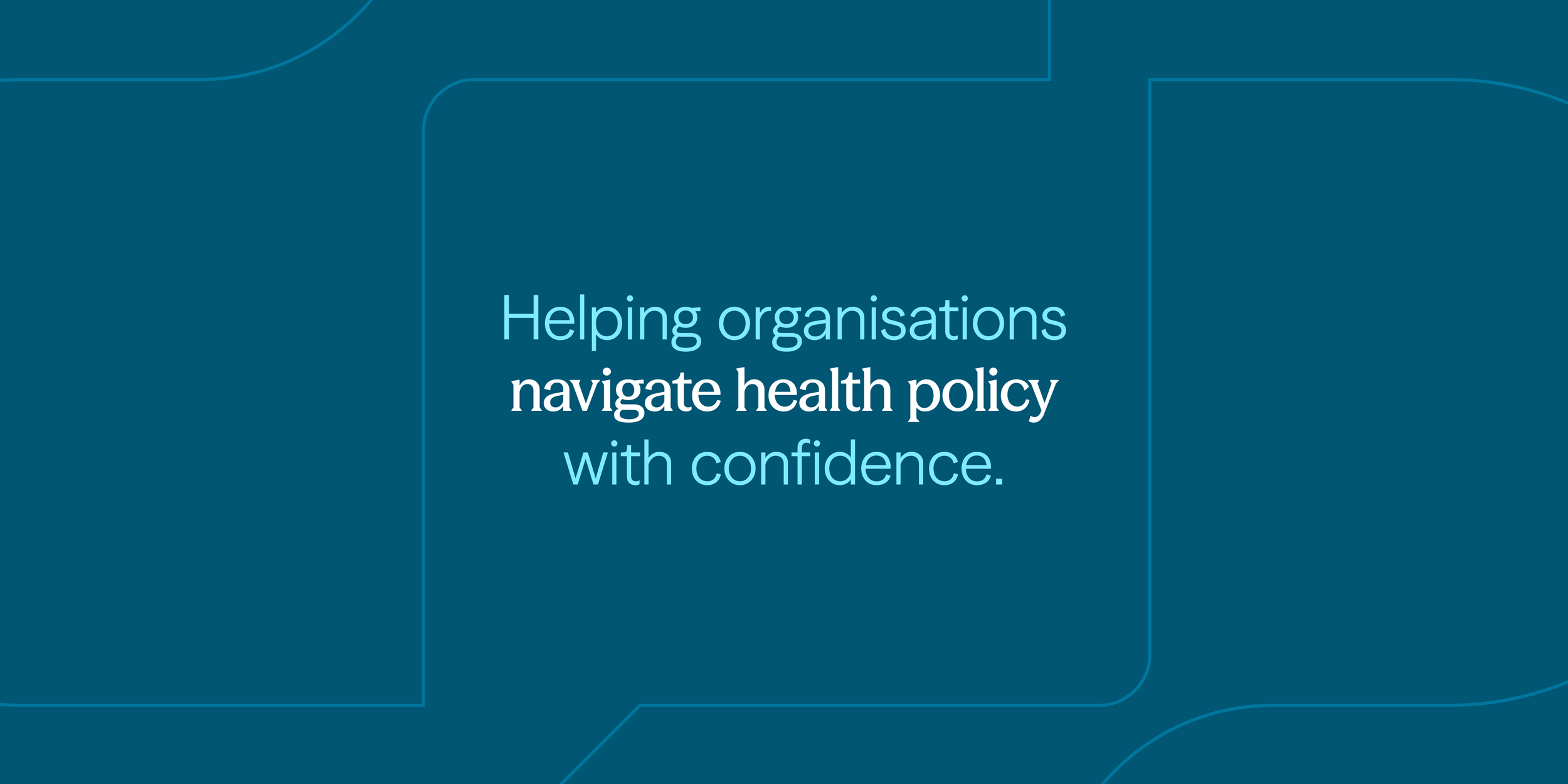
When they approached Keel Studio, the business was at the very beginning of its journey. They needed a brand identity that could establish immediate credibility with major health bodies, while remaining human, collaborative and accessible. The challenge was to strike a careful balance: authoritative without feeling remote, and professional without becoming overly corporate.
What we delivered:
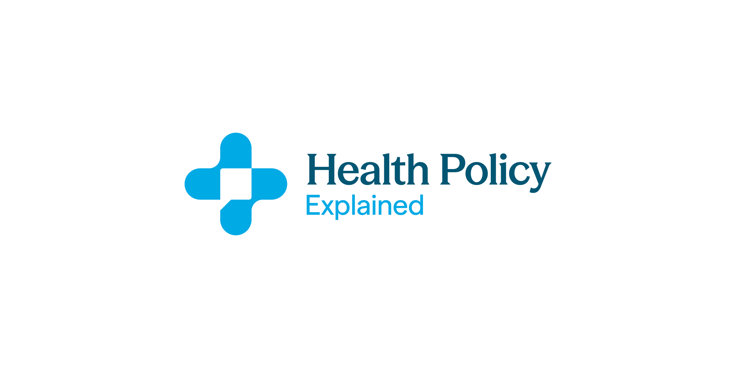
We developed a brand identity designed to communicate trust, clarity and expertise.
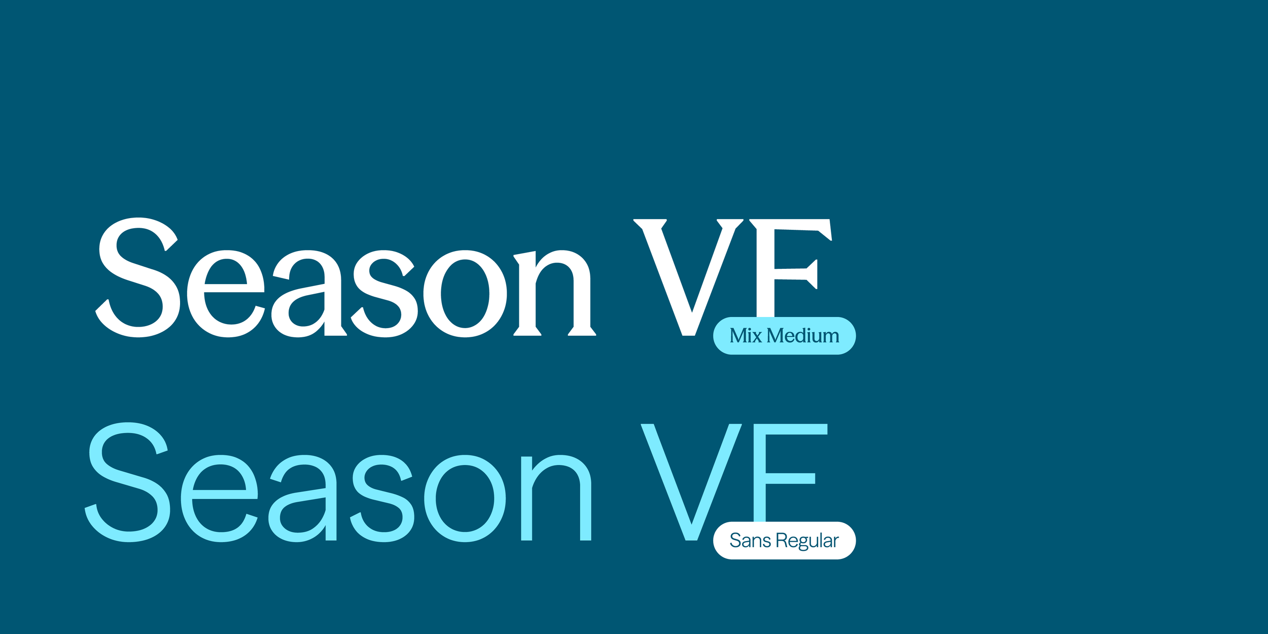
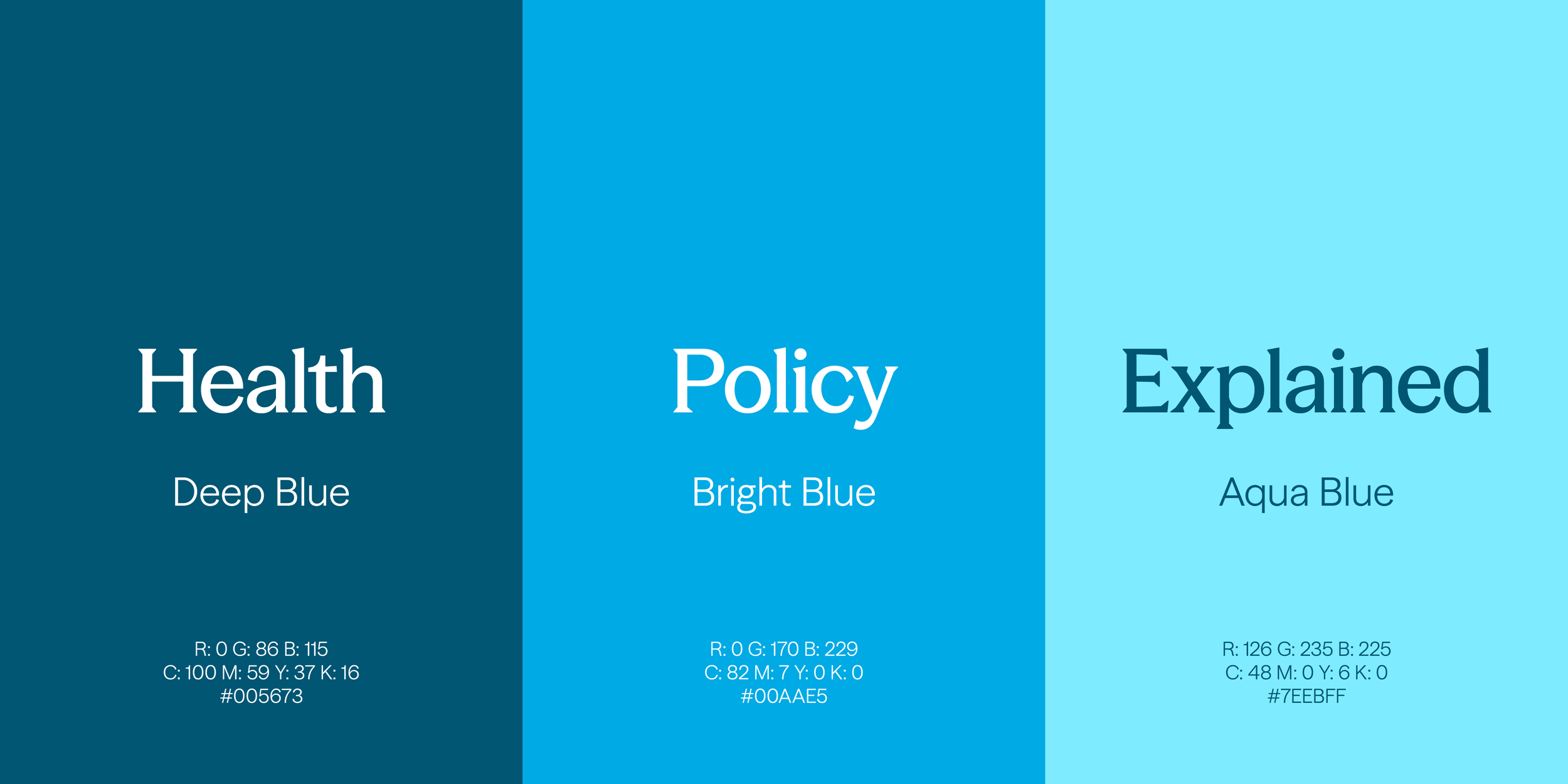
The visual system is anchored in a palette of fresh, clinical blues, signalling credibility and reassurance without feeling cold. A contrasting typographic system pairs a modern, traditional serif with a clean sans-serif from the same family - an abstract reflection of working between national policy-makers and local teams, and of simplifying complex policy from the top down.
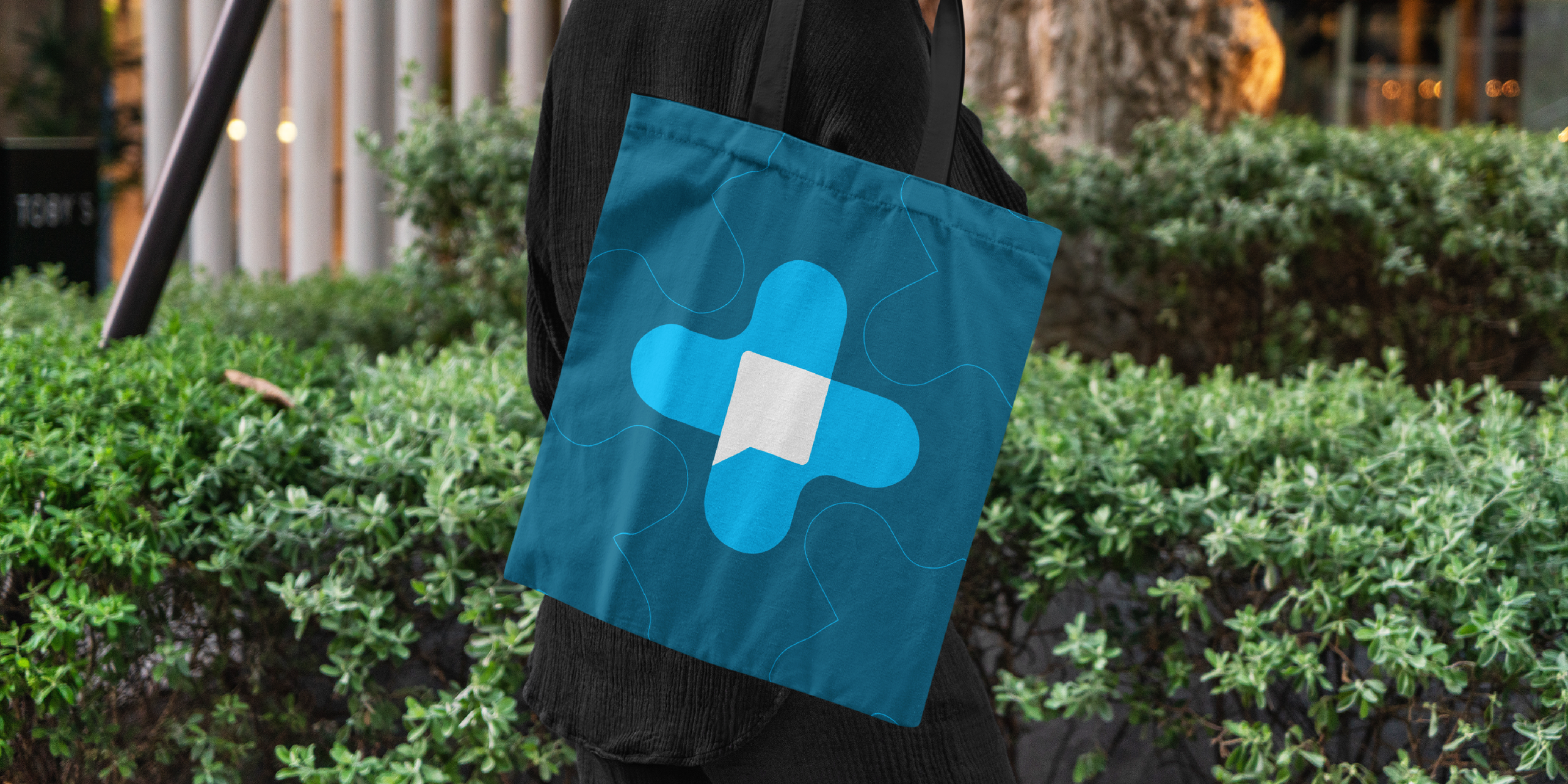
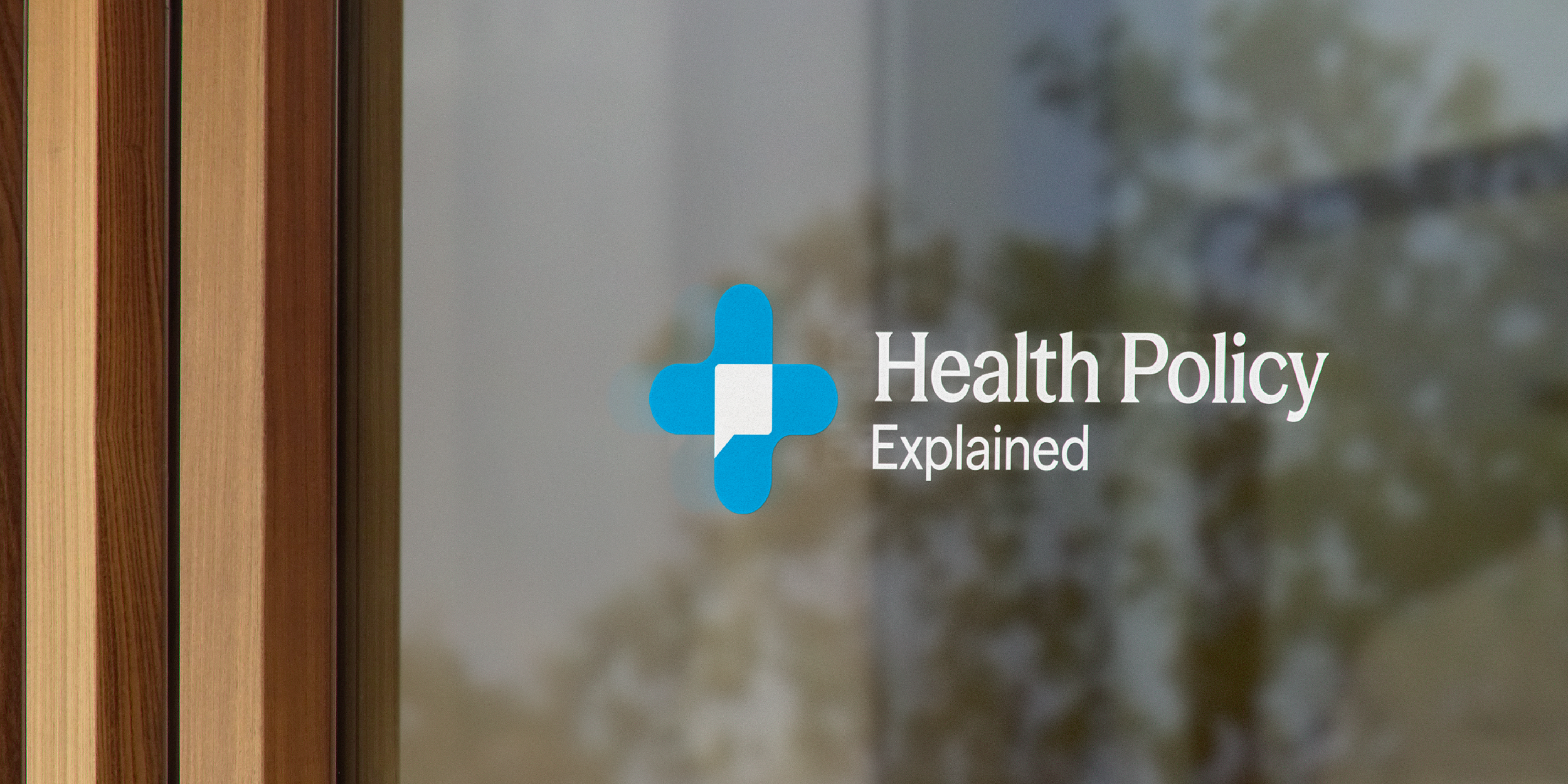
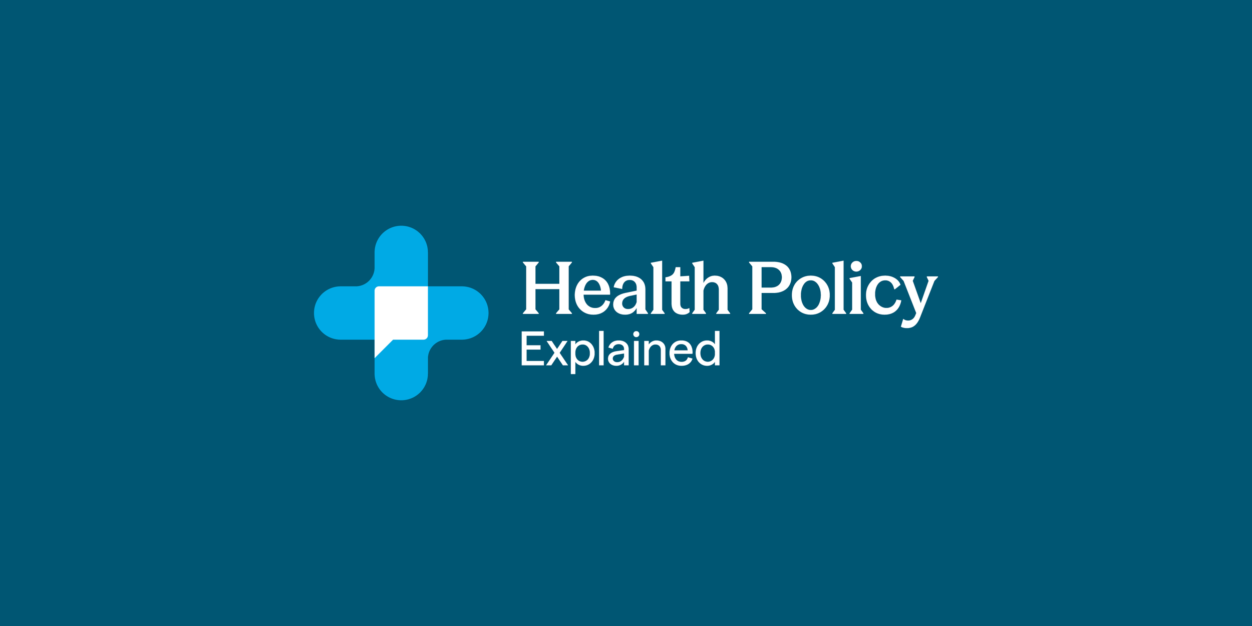
At the heart of the identity is a custom logo mark that unites healthcare and communication. By combining the healthcare cross with abstract heart forms, set at a 45-degree angle and intersected by a speech bubble through negative space, the mark captures the brand’s core purpose: explaining health policy in a way people can understand.
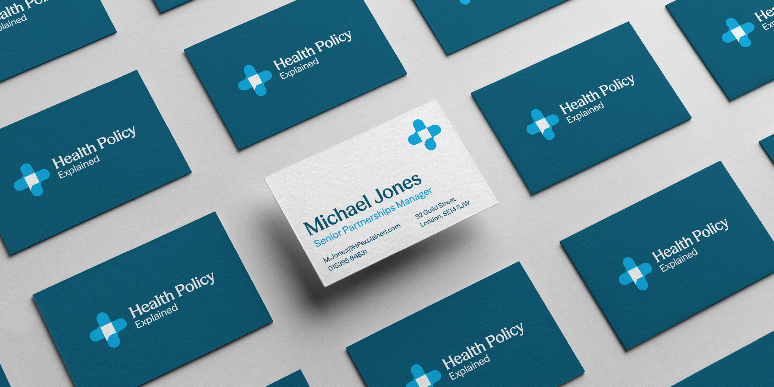
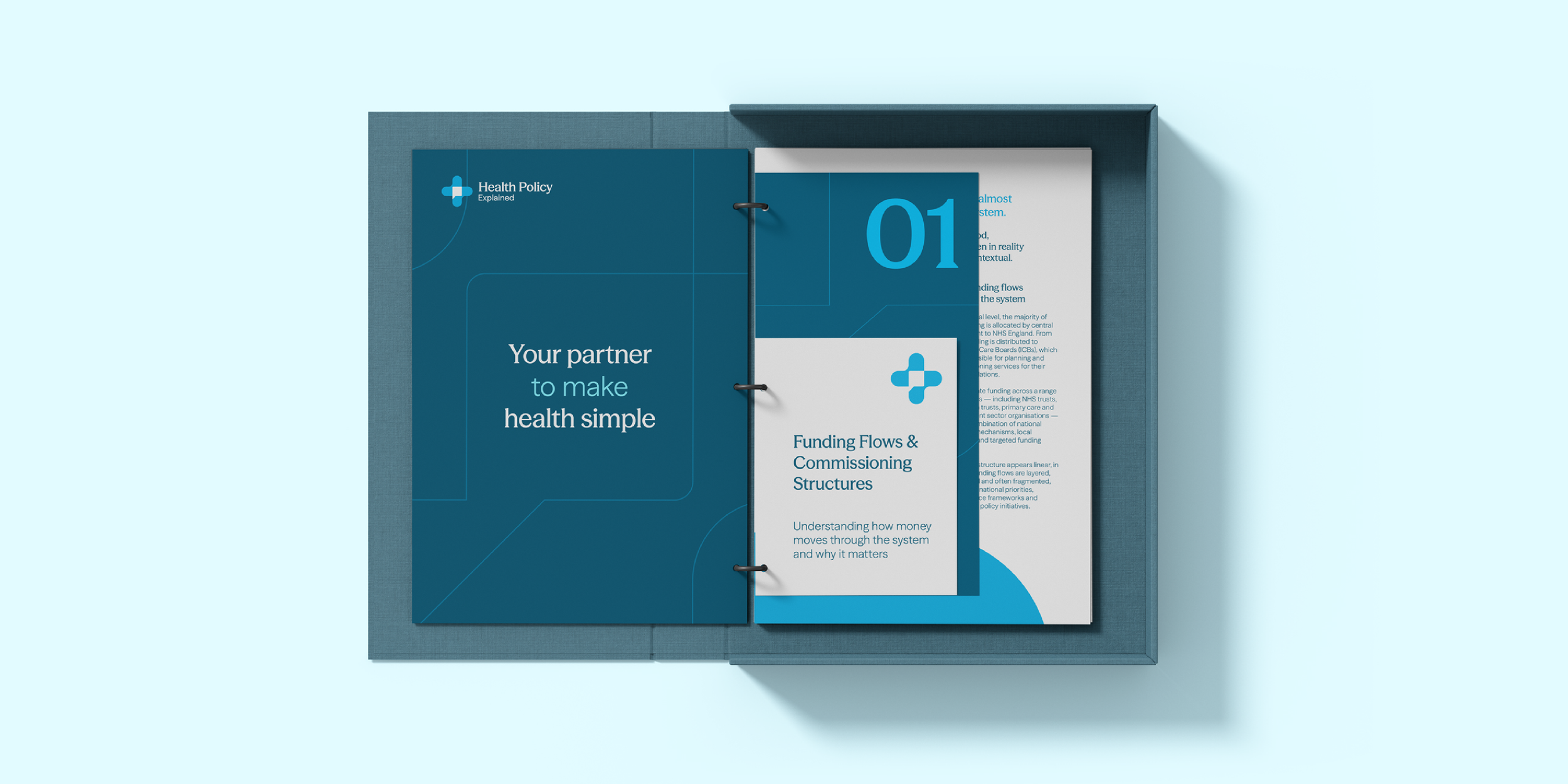
The visual language is designed to scale seamlessly across strategy documents, print collateral and digital campaigns, remaining consistent and recognisable at every touchpoint.


“Keel Studio immediately understood the balance we needed to strike - authority without intimidation, clarity without oversimplification. They translated a complex brief into a confident, thoughtful brand that genuinely reflects how we work and how we want to be perceived.”
The Outcome
Expert, but approachable.
The new identity positions Health Policy Explained as a confident, credible and human voice within healthcare consultancy. It clearly communicates authority while remaining open and collaborative, helping the brand connect with both national institutions and local teams.
With a distinctive visual language and a logo that intelligently reflects its purpose, Health Policy Explained is now equipped to engage, explain and influence across a complex healthcare landscape.
Deliverables
Logo and visual identity system
Brand guidelines
Print materials, including business cards and brochures
Digital advertising and campaign assets