
Peacocks Hair Studio
Elevating a trusted local name into a premium, inclusive hair brand
The Brief:
Peacocks Hair Studio is an independent premium salon and barbers with a strong local reputation, built over more than 12 years under the name Peacocks Barbers. Known for the quality of their craft and consistency of service, the business had long been at the top of its game.
As the studio introduced a new co-owner and opened a newly designed space with distinct areas for men’s and women’s hair, it became clear the brand had outgrown its name. Despite having highly skilled salon stylists alongside expert barbers, the word barbers led many potential clients to assume the business catered exclusively to men.
Peacocks approached Keel Studio to reposition and rebrand the business as it entered its next chapter. The goal was to create a more mature, premium identity that reflected the quality of the experience, appealed clearly to both men and women, and supported future growth, without alienating the loyal customer base that had helped build the brand.
What we delivered:
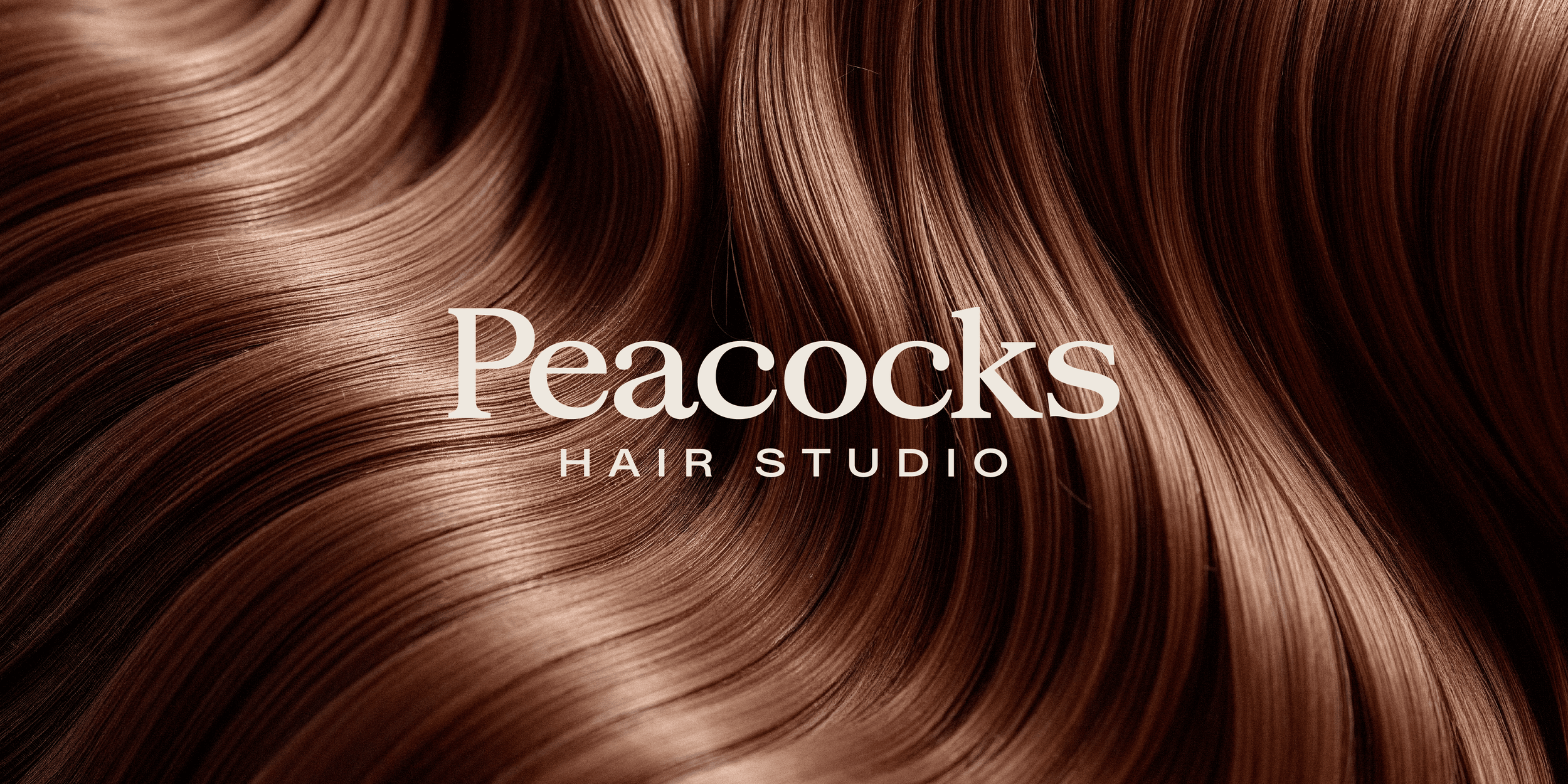
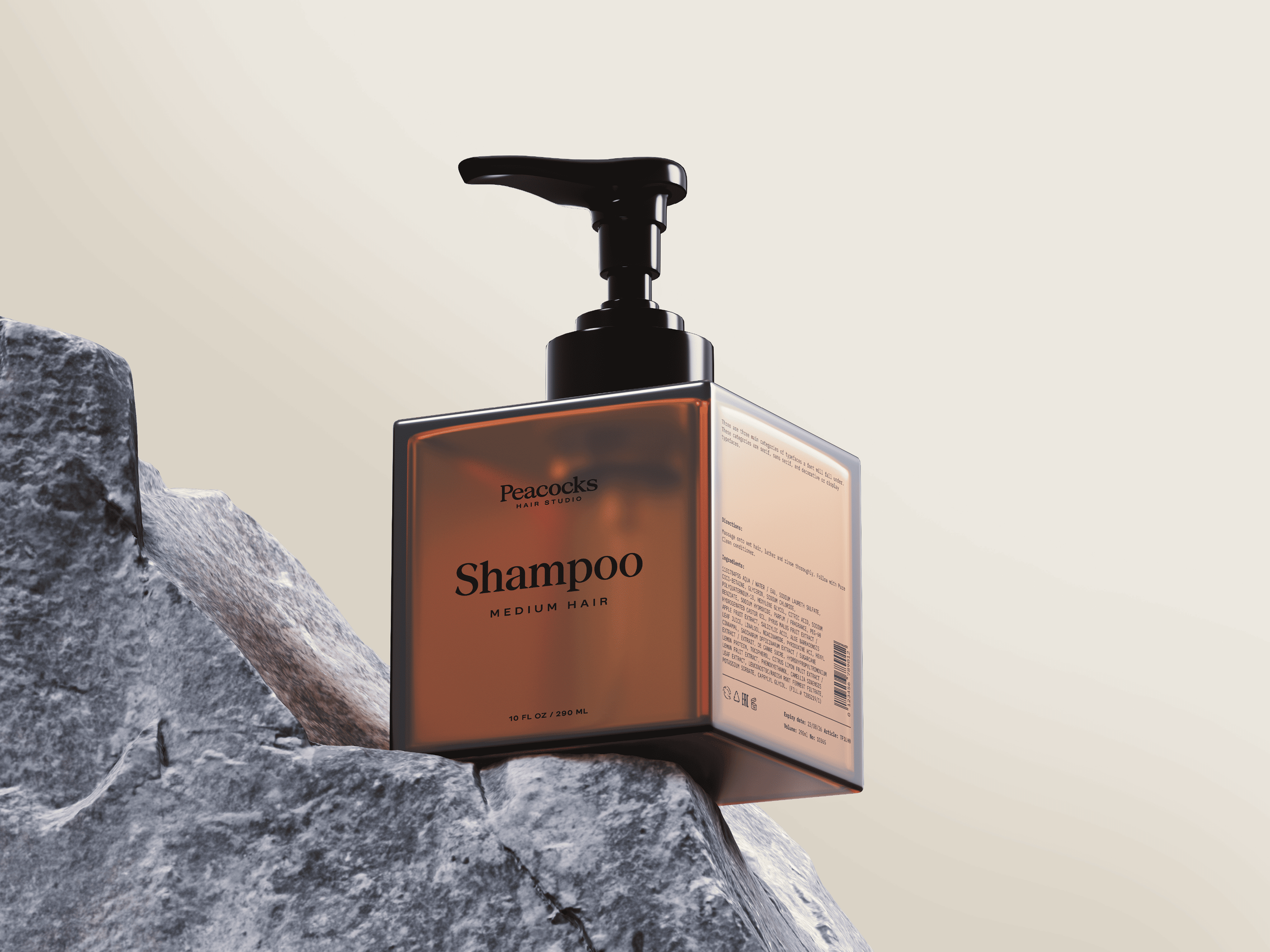
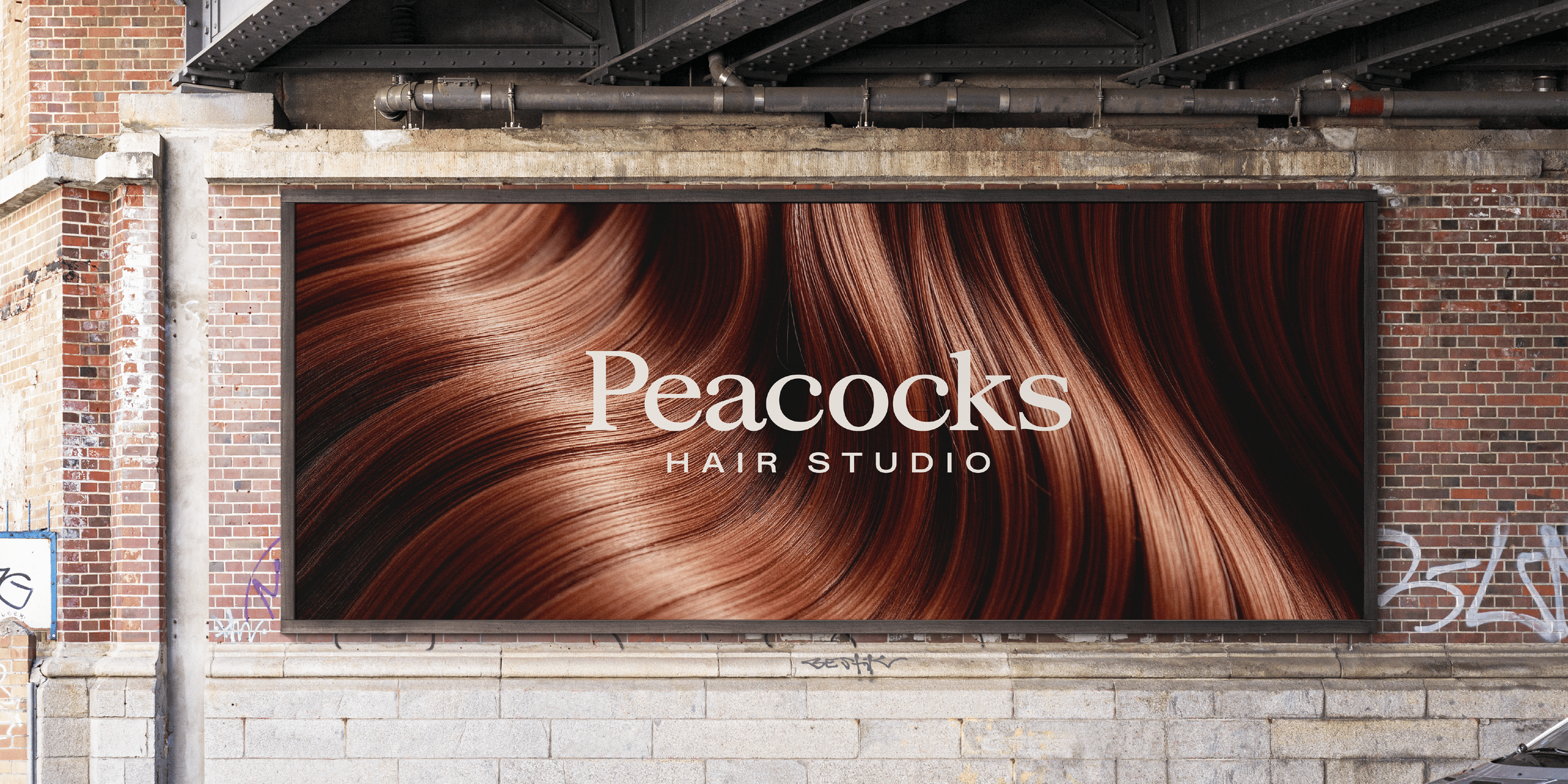
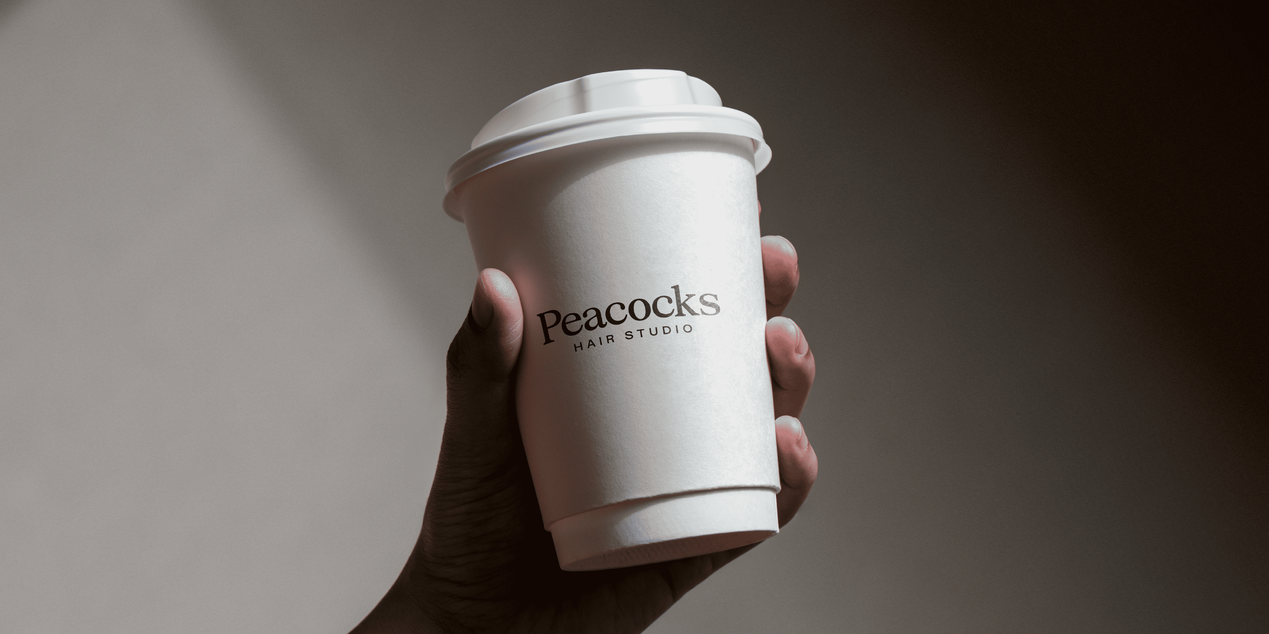
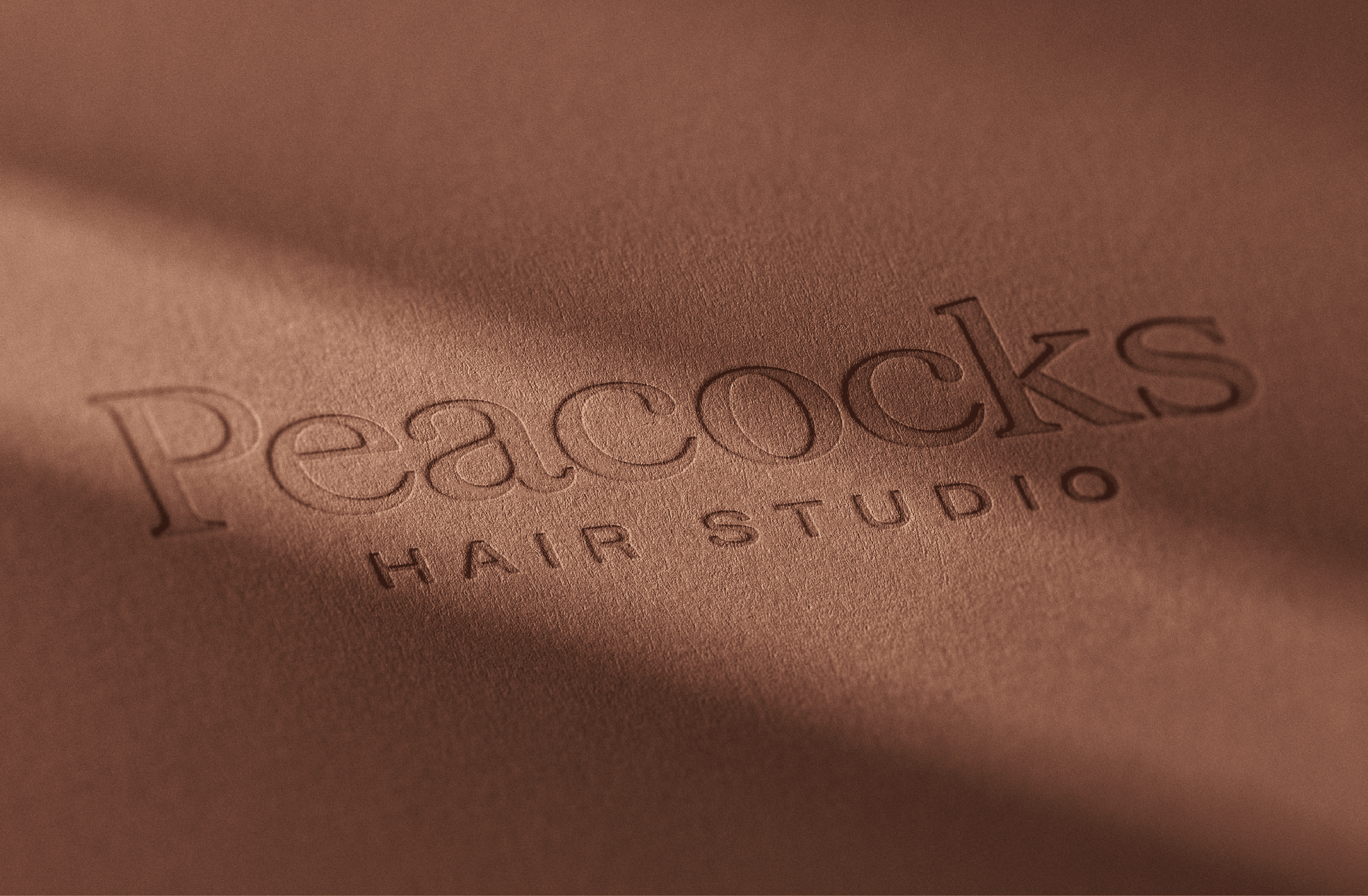
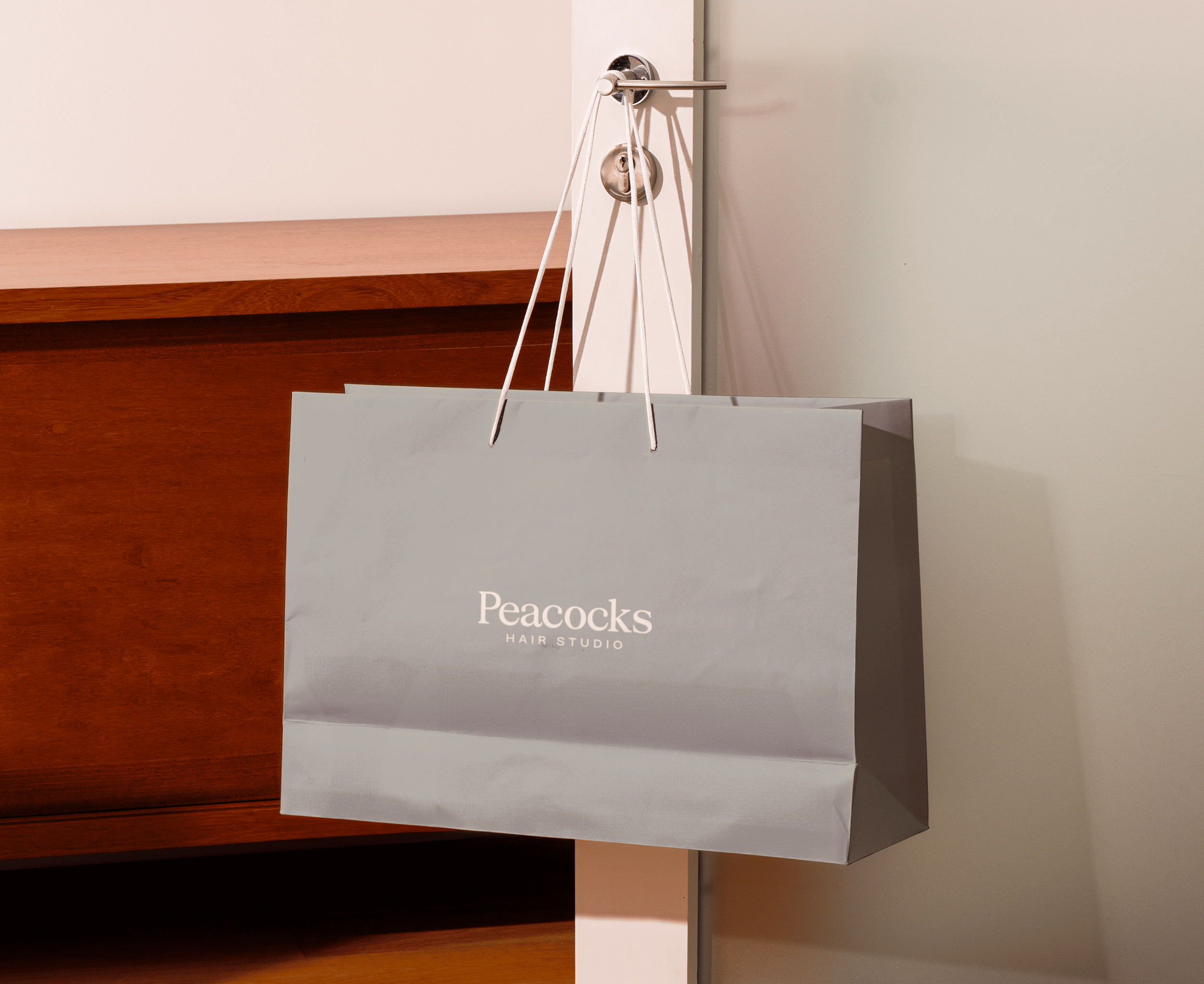
We created a refined, typography-led brand identity designed to feel premium, welcoming and confident.
The new name, Peacocks Hair Studio, broadens the brand’s appeal while remaining familiar and rooted in its history. The identity is built around thoughtful typography, clean layouts and a carefully balanced colour system that reflects both sides of the business.
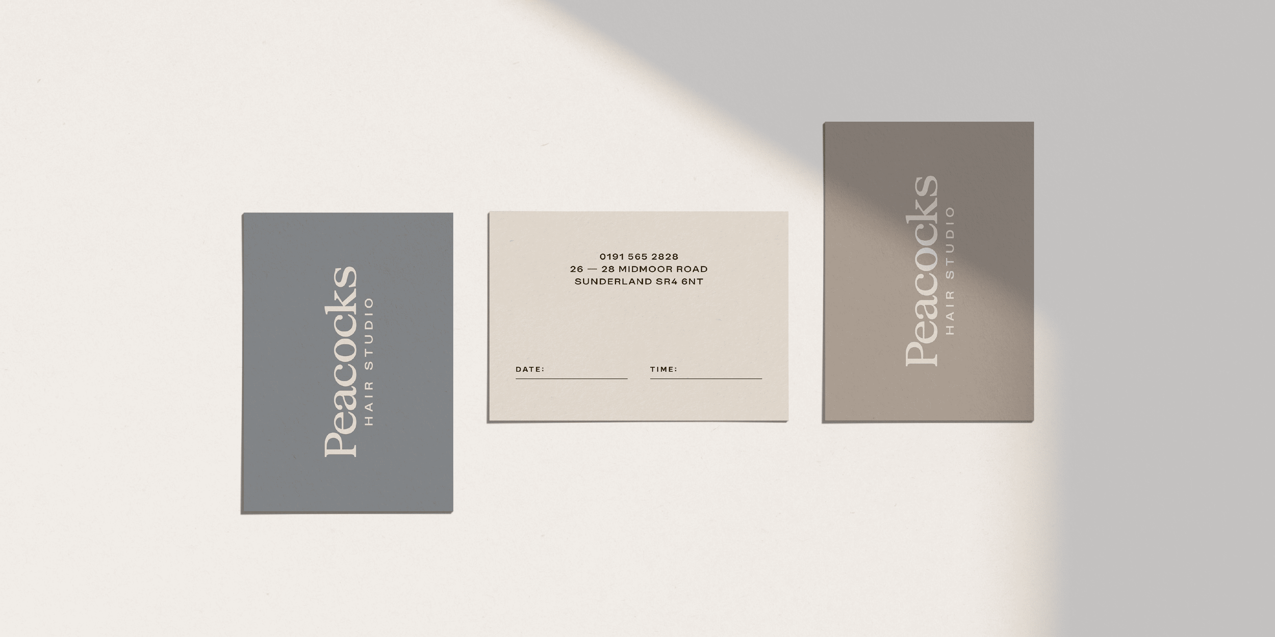
A single master logo anchors the brand, supported by a flexible colour palette that subtly distinguishes between the barbers and salon spaces. Each colour can stand confidently on its own when needed, while working harmoniously as part of a unified system - mirroring the physical split of the studio and the dual nature of the services offered.
Rather than relying on overt symbols, the brand focuses on restraint and clarity. The result is an identity that feels considered and modern, allowing the quality of the craft, the space and the people to take centre stage.
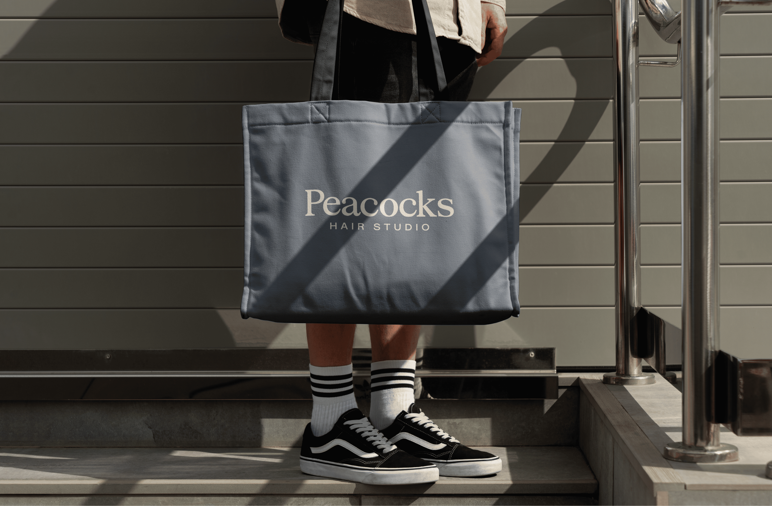
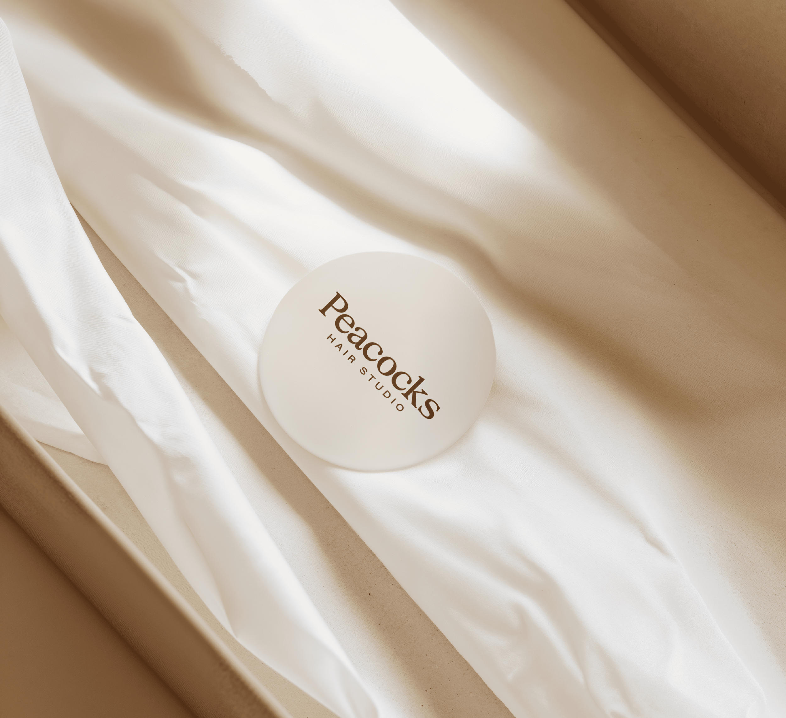
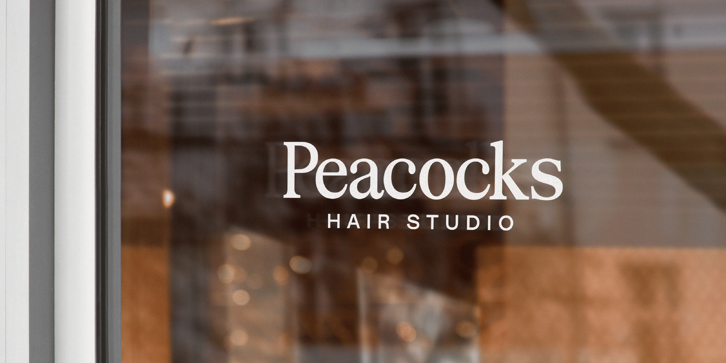
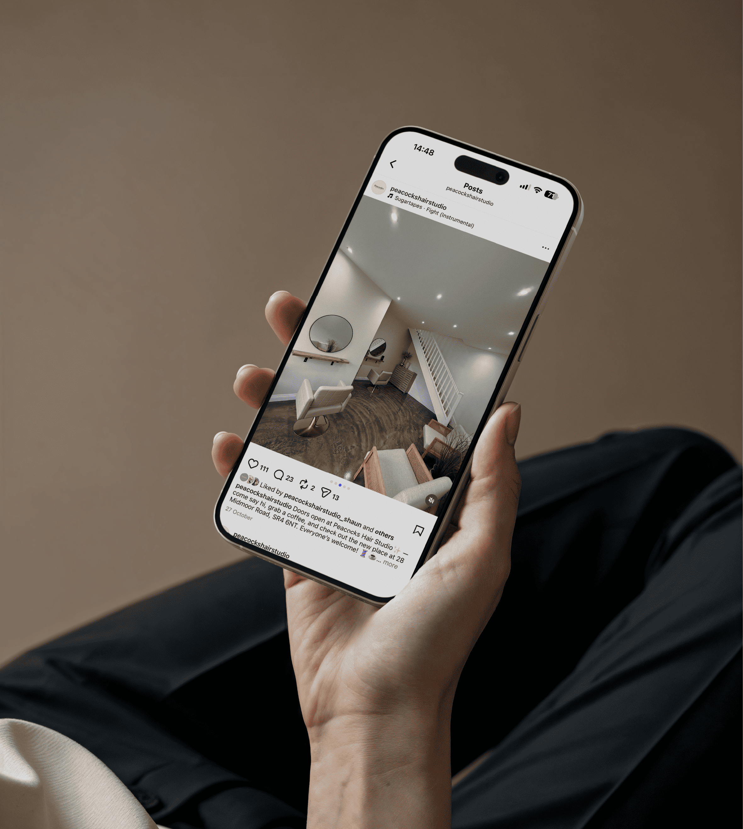
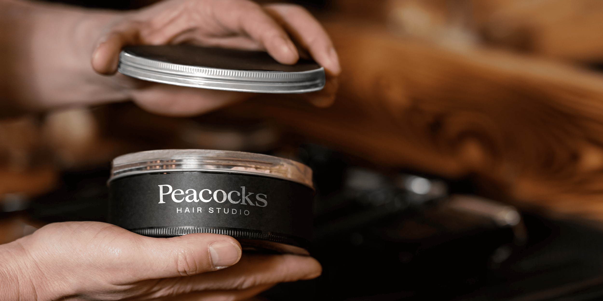
The visual system was designed to translate seamlessly across signage, print, social media, merchandise and in-studio touchpoints, creating a consistent and elevated experience at every interaction.
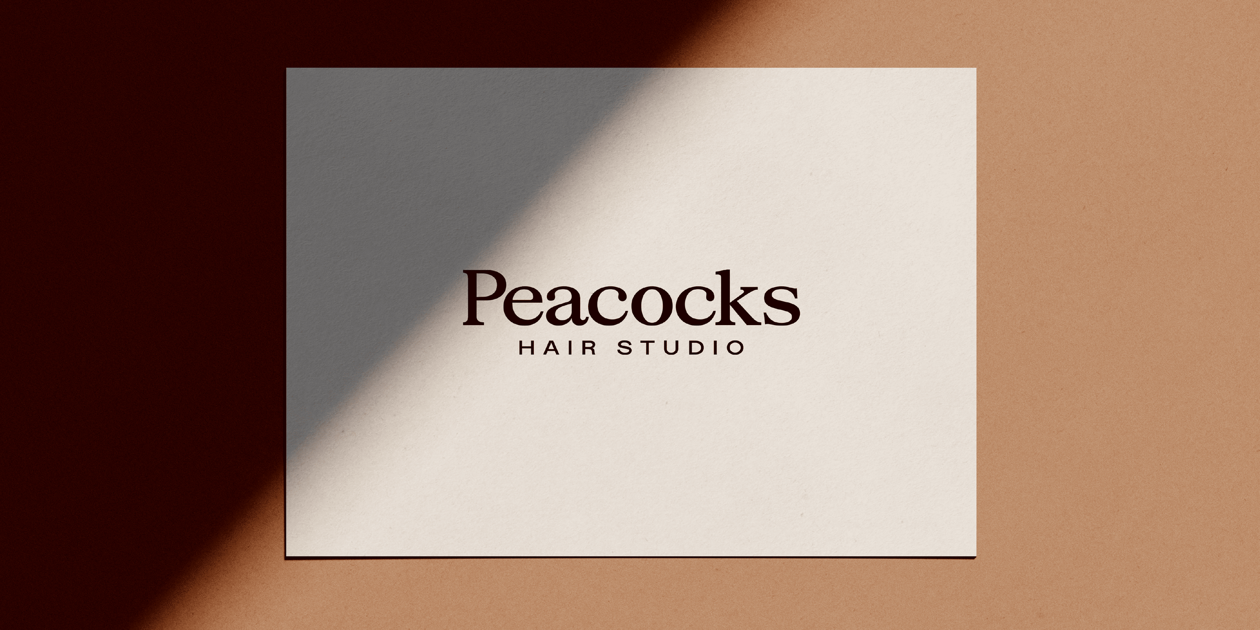
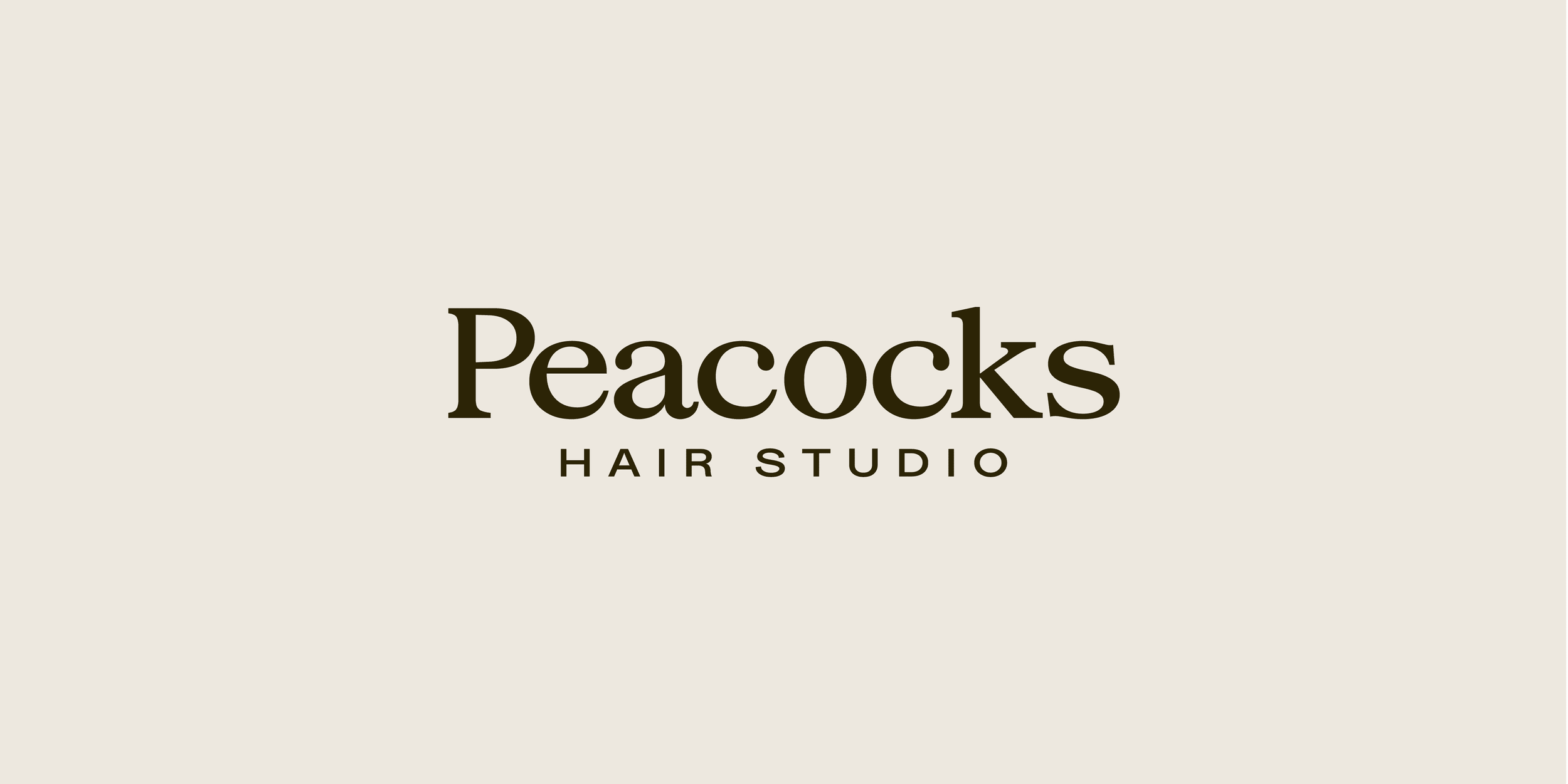
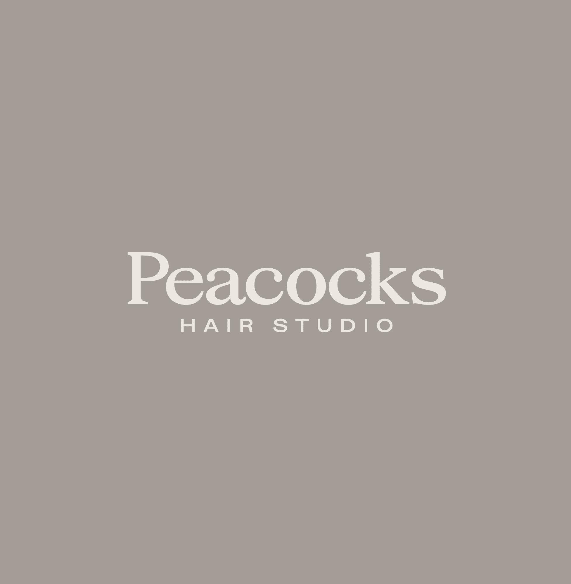
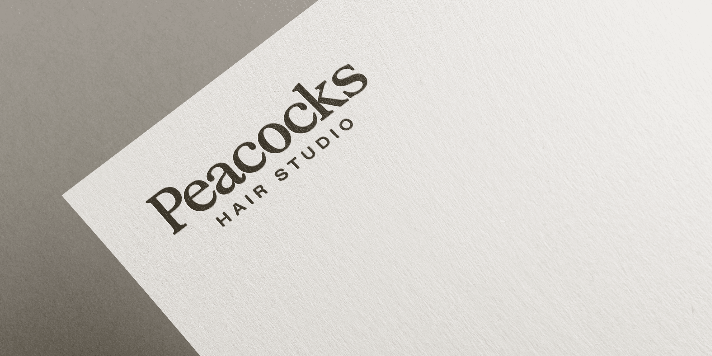
Peacocks Hair Studio - master logo.
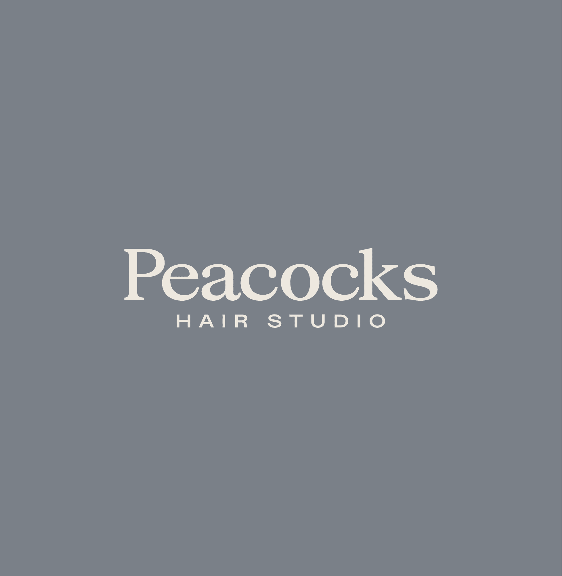
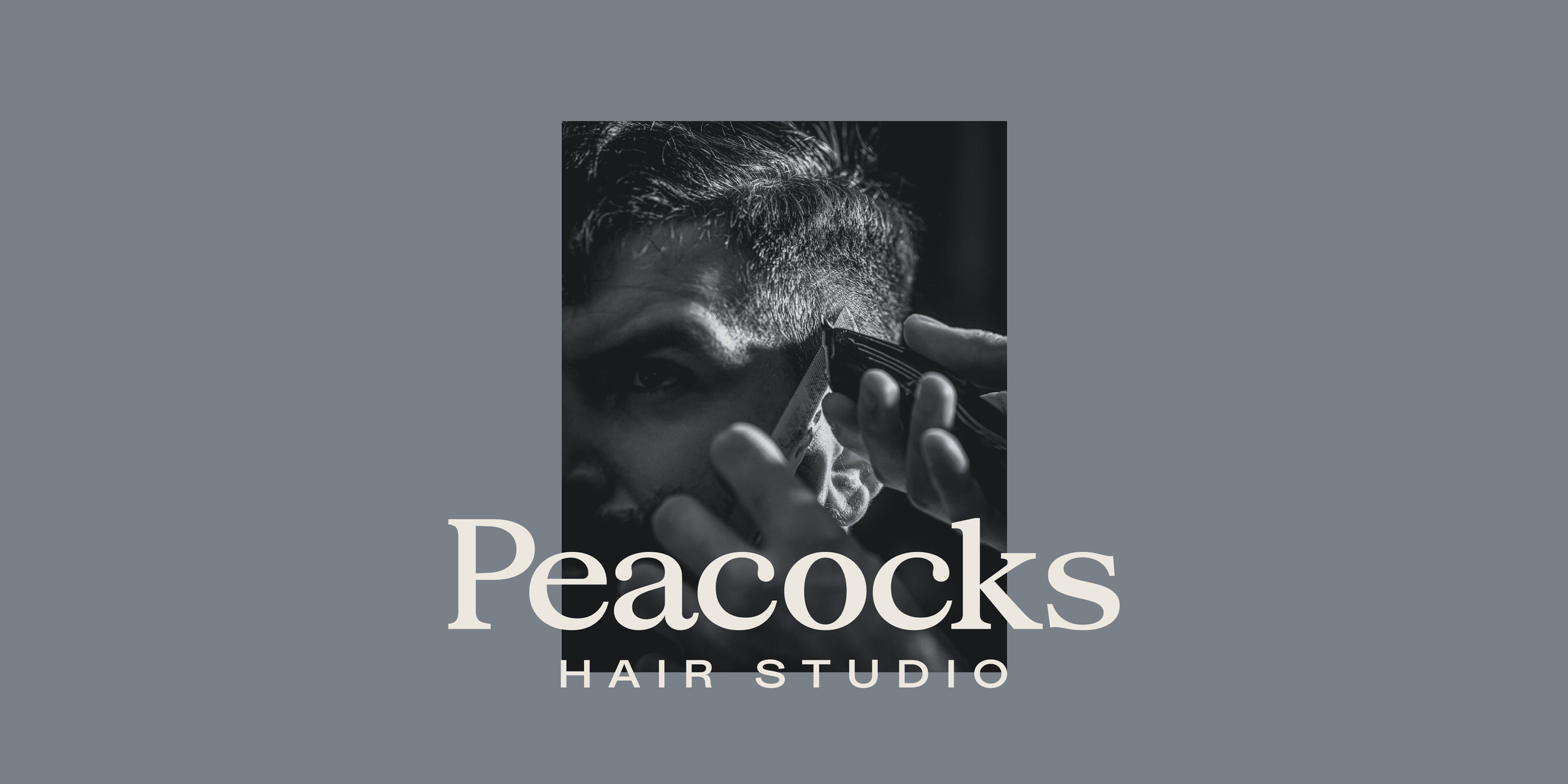
Barbering colour application.
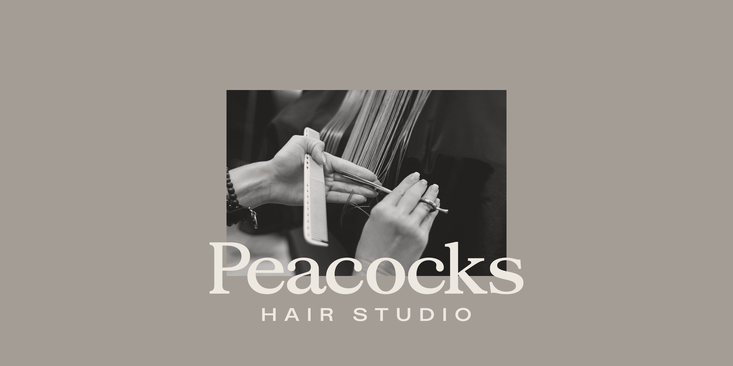
Salon colour application.
“Huge thanks to Keel Studio for absolutely smashing our design work. From the business cards to the logo and vouchers, he brought our vision to life perfectly. They were amazing at listening to what we wanted, working around us, and bringing our ideas to life in a way that was even better than we imagined. Professional, creative, and an absolute dream to work with - couldn’t recommend him enough.”
The Outcome
Premium, but approachable.
The rebrand positions Peacocks Hair Studio as a mature, professional and confidently inclusive hair destination. It clearly communicates the breadth of services on offer, making the salon side of the business more visible while continuing to resonate with long-standing barbering clients.
With a clear market position and a cohesive visual language, Peacocks now stands out as a recognisable, high-quality brand, one that reflects the skill, care and experience customers receive the moment they walk through the door.
Deliverables
Logo and visual identity system
Signage and in-studio applications
Social media imagery and brand assets
Price lists and appointment cards
Business cards and printed materials
Photography and art direction
Branded merchandise, including tote bags, t-shirts, gowns, aprons and coffee cups