
Prudhoe Dental Practice
Building a modern, reassuring brand identity for a trusted local dental practice.

The Brief:
Following the takeover of an existing dental practice, Prudhoe Dental Practice needed a complete rebrand to establish a new identity and clearly communicate the change to both existing and prospective patients.
While the practice already had an established patient base and strong local presence, the brand needed to reflect the new direction of the business while maintaining a sense of familiarity and trust.
The previous branding lacked cohesion and didn’t fully represent the professionalism, warmth, and quality of care the new team wanted the practice to be known for. Alongside this, the website no longer reflected the standard of the practice and needed a more modern, user-friendly experience.
The goal was to create a cohesive visual identity and digital presence that felt calm, trustworthy, and contemporary while remaining approachable to patients of all ages.
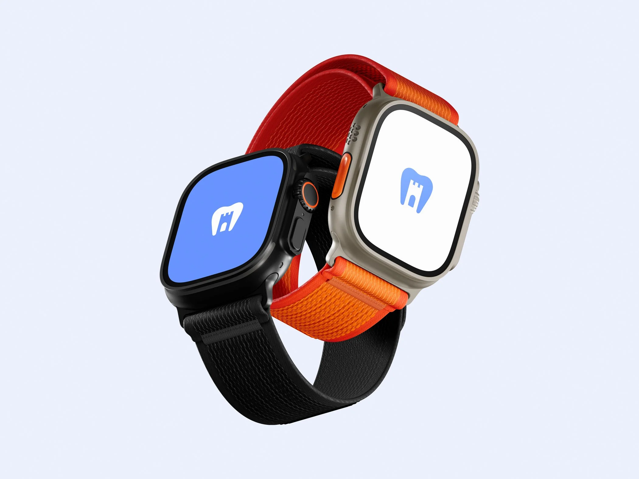
The project required a flexible identity system capable of working consistently across signage, print materials, social media, and a fully redesigned responsive website.
What we delivered:
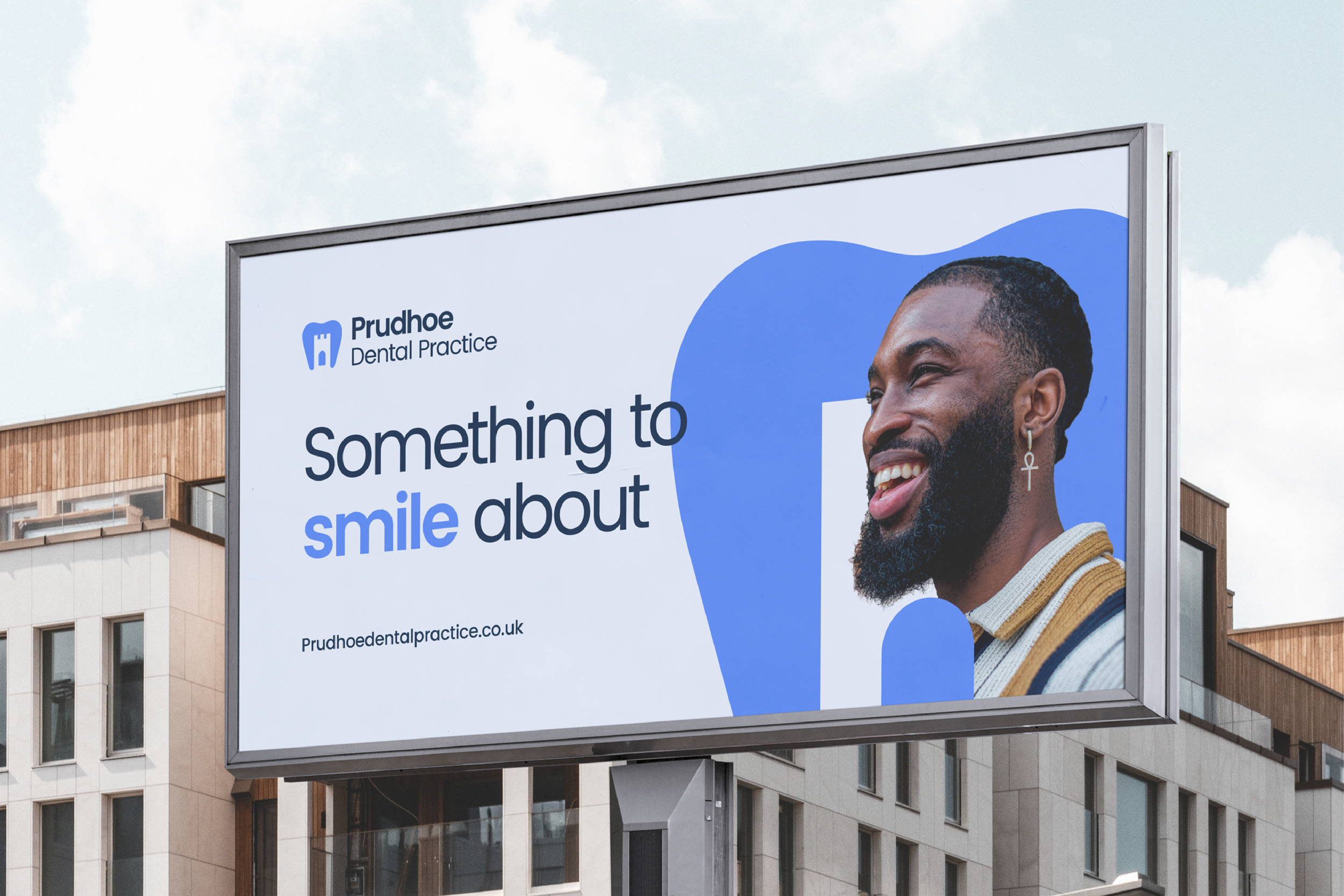
We developed a complete visual identity system alongside a new website experience designed to improve both perception and usability.
Our process began with discovery sessions focused on understanding the practice, its audience, and the experience patients receive from the moment they walk through the door.
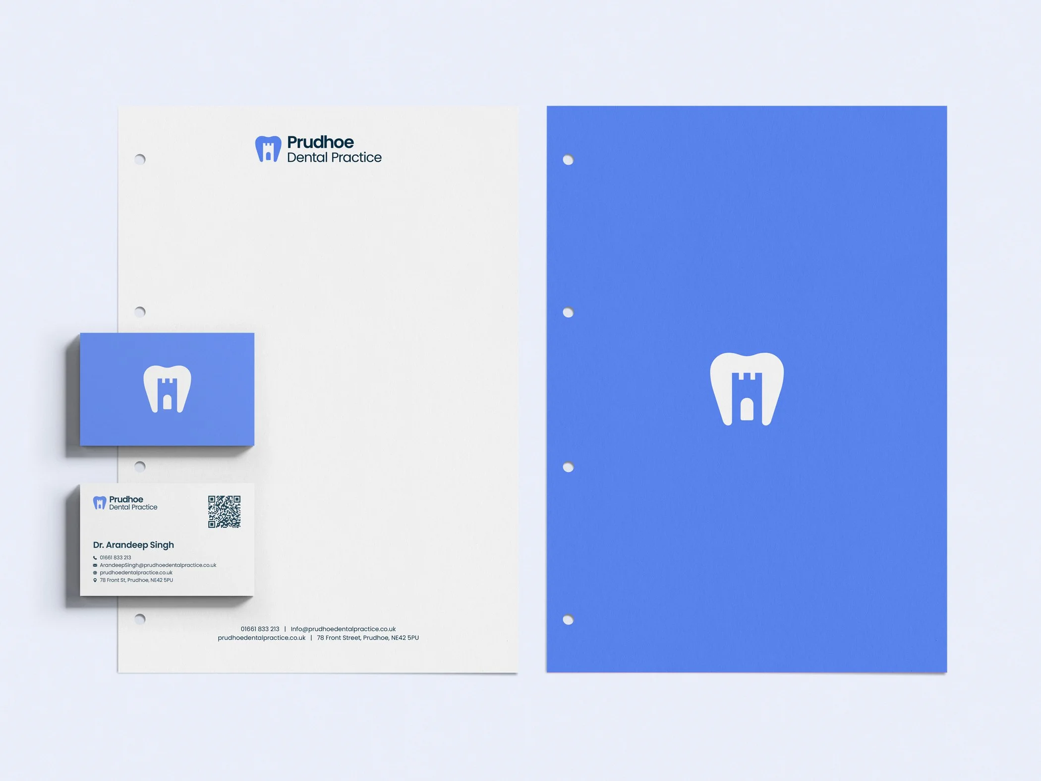
The identity system combined:
A clean, contemporary logo mark
A calming and professional colour palette
Modern typography with strong legibility
A flexible visual system for print and digital use
Consistent brand application across patient-facing materials
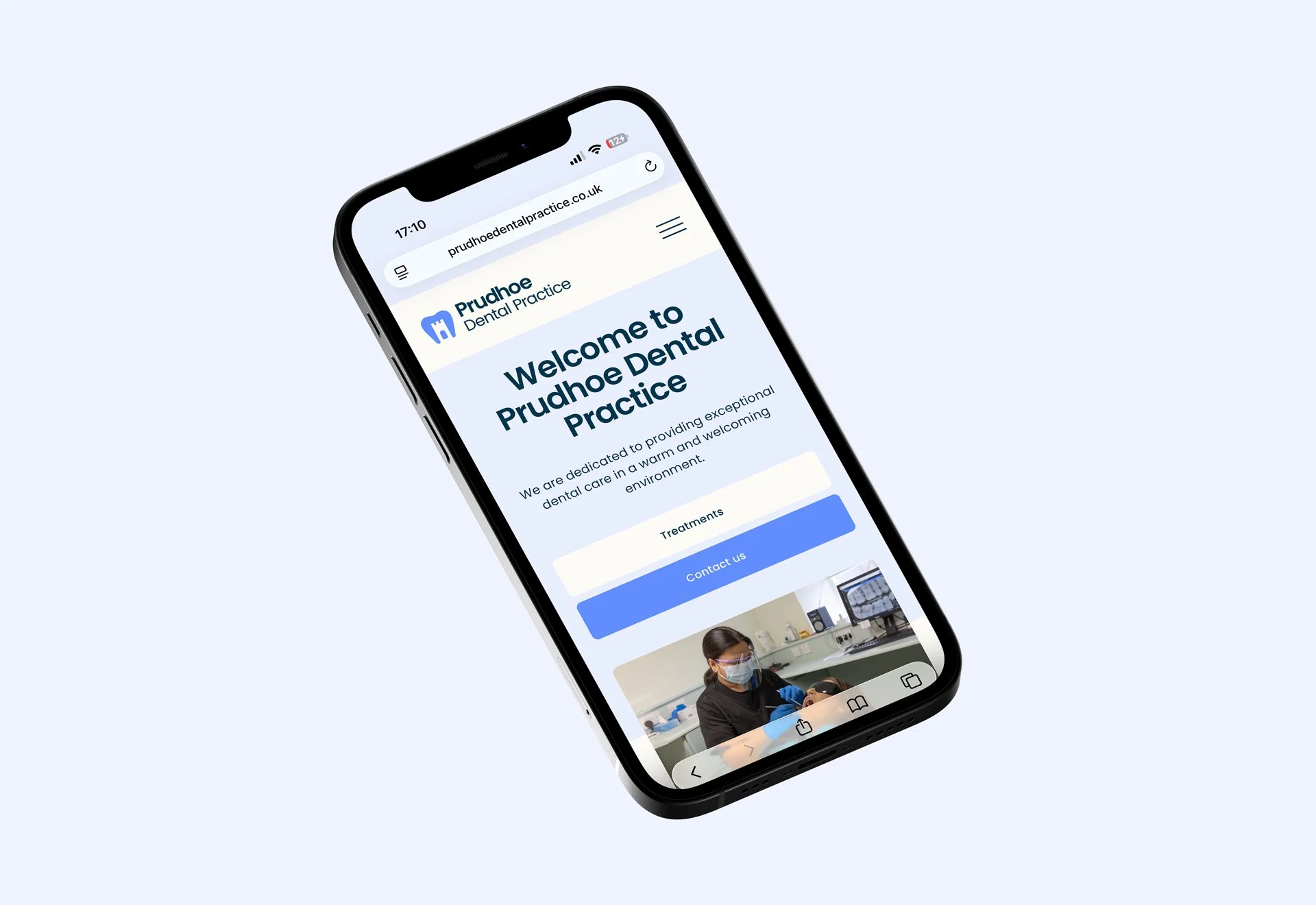
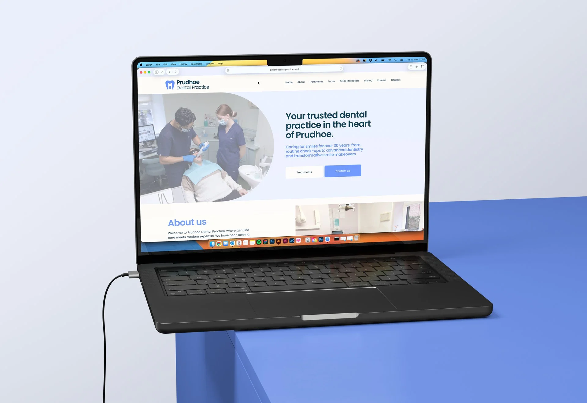
Alongside the identity work, we designed and developed a fully responsive website that aligned with the new brand direction.
The website was created to improve clarity, accessibility, and ease of navigation, helping users quickly find information about treatments, contact the practice, and book appointments in a way that feels simple and reassuring.
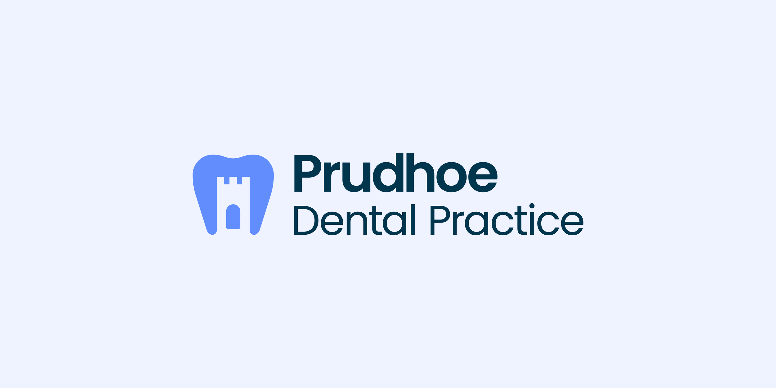
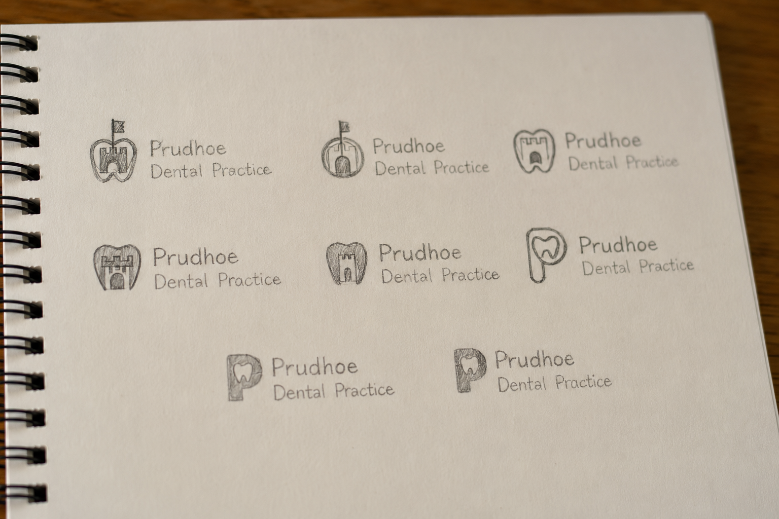
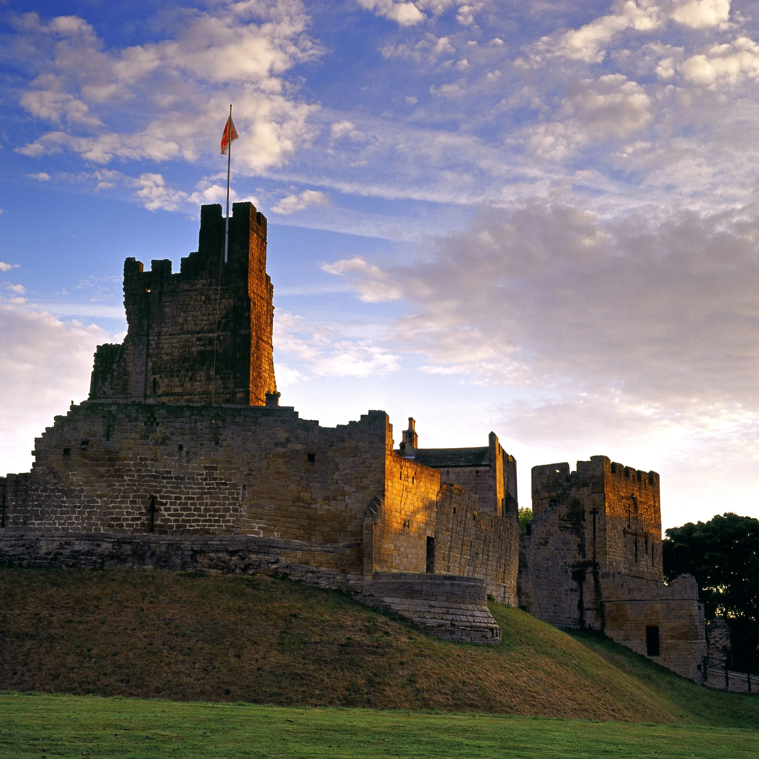
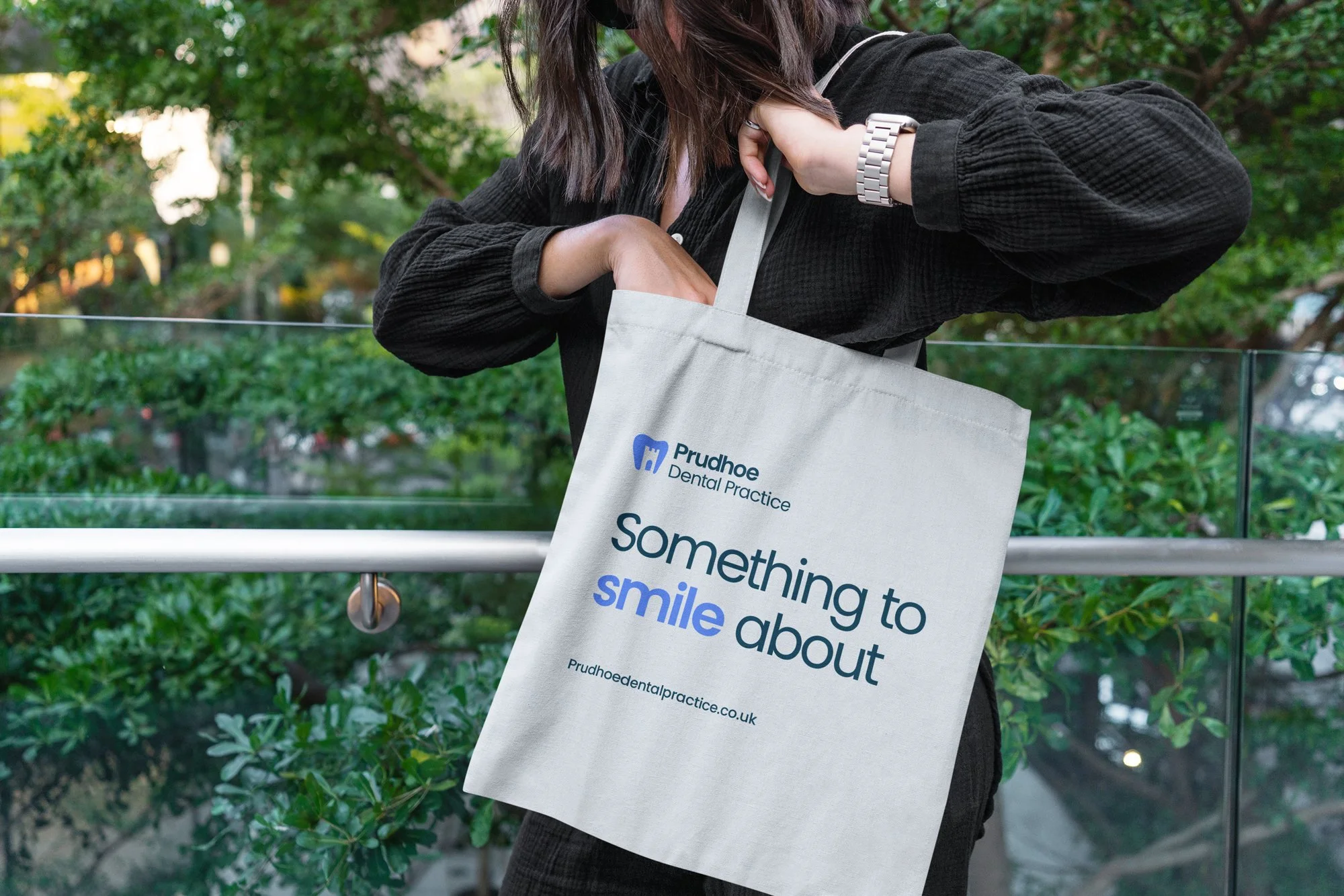
The logo was inspired by the iconic silhouette of Prudhoe Castle, using negative space to seamlessly combine both the shape of a castle and a tooth into a single distinctive mark that feels both locally rooted and instantly recognisable.

The Outcome
The final result gave Prudhoe Dental Practice a more confident and cohesive presence across both physical and digital touchpoints.
By modernising the visual identity while maintaining a sense of familiarity and trust, the practice now has a brand system built to support future growth while better reflecting the quality of care delivered by the team.
The redesigned website further strengthened the overall brand experience, creating a professional digital presence that feels aligned, accessible, and patient-focused.
The project demonstrates how thoughtful branding and web design can help healthcare businesses feel more human, approachable, and memorable without losing credibility.
Deliverables
Brand Identity
Logo Design
Creative Direction
Colour Palette Development
Typography System
Brand Guidelines
Print Design
Social Media Assets
Website Design
Website Development
Responsive User Experience Design